By the end of second years PPP presentation it dawned on me how much I have changed this year in terms of my abilities, the skills I've acquired and the type of working I am producing now compared to last year. This module has been incredibly insightful and made me look at the industry in a more in depth way than I have before. There was a number of tasks I undertook throughout the module that made me aware of things that I wasn't previously, whether this was animation studio research or analysing my own practice and reflecting on the year through the create strategies tasks. I saw the creative strategies brief as an opportunity to explore and understand a range of processes and techniques that I otherwise wouldn't necessarily have done. Specifically, I made the effort to look into areas of familiarity such as film and some areas that I wasn't so familiar with such as the industry, careers and studios. The 'Brand Me' brief also gave me the opportunity to start thinking about what I want to do further and how to represent myself visually through the use of bespoke branding. I learnt that I much prefer visuals when branding to the use of text and think that in many cases an image is more effective and communicate more to an audience than a word or two could do in its place. The research brief on an animation studio made me aware once looking into various studios about the types of infrastructure studios have combined with the types of projects different studios work on and what seperates them from each other. I think as much as I have learnt myself throughout this module I have been informed by others about animation studios, different types of work that is out there and from collaborating for the 'Pitch Perfect' brief I learnt a lot from my group regarding communication and efficiency within a group as well as working in seperate roles.
Collaboration was again emphasised in the 'Pitch Perfect' brief. This was a difficult but undoubtedly rewarding brief as it informed me of areas that unless I went ahead and tried them out I wouldn't have known. The way we created an imaginary brand with all the real life considerations that would have to be made was very helpful and put things into perspective for me when it came to costs, opportunities and competition within the industry. Working with my group was a good experience overall and gave me another chance to improve my ability to communicate and collaborate with others. The dynamics in this particular collaboration felt different to the previous three we had done throughout the year and I believe this was because instead of being a purely creative endeavor it was a business driven task that meant we all had to take on roles and support each other in order to succeed as a group - especially when none of us had any real experience doing something like this. Visiting professionals such as Barry Purves, Dave Alex from Aardman and Zane Whittingham from Fettle animation gave me some first hand insight into the industry and because of their contrasting roles within it we were given a broad spectrum of ideas and experiences to think about. I particularly liked Barry Purves as a visiting lecturer and thought his enthusiasm for his craft was inspiring. Furthermore, his work and his ideas I think in some ways embody what animation is about: performance, storytelling and art.
From my self analysis I can say that although I have a broad range of focuses at the moment it would be good to narrow down that focus and really explore one particular way of working or one particular role within all the fields that there are. I currently have interests in 2D and 3D animation as well as writing, film making and illustration - so I want to decide what I'm best at and see where I can go from there. The vatiety of platforms I enjoy lead me through Mike's advice to 'transmedia storytelling' and the method of communicating stories over a variety of platforms is a concept that I have started to investigate as this year has come to a close and I look forward to finding out more about it as I start researching it over the summer as well as undertaking a variety of other creative endeavors to hopefully in turn discover my focus.
Tuesday, 17 May 2016
OUAN502 - Creative Strategies Presentation
The creative strategies presentation was a reflection on our year as a whole, what we have learnt and how we have changed as well as out plans for next year. I sort of broke my presentation down into an imaginary 'beginning, middle and end' discussing how I felt during the start of the year and how my interests developed before moving onto my ideas and aims for third year. I made sure to mention my interest in film because I believe that has what has fuelled my year on the whole, and the things I've been able to learn about editing, cinematography and film making in general have inspired me and improved my work dramatically. I didn't really talk about any specific modules but rather mentioned them briefly when talking about collaboration or a certain technique that was explored during the module. I didn't talk about any specific work either, but did use some of my stronger pieces to add visual interest to slides and tie into what I was talking about in some way, for example when talking about collaboration I showed work from the collaborative modules.
The largest portion of my presentation was spent talking about my current interests and working methods, and also my current aims between now and third year. I spoke about my diverse interest because of the amount of different media we have been exposed to through different modules and the link this has to transmedia storytelling. I mentioned that one of my aims for next year was to get in contact with industry more and hopefully make some contacts within the industry - as this is something I am yet to do. I seem to spend a lot of time researching on the internet with general topics as oppose to contacting people directly to find out from professional and indviduals who can give me good advice from their own experiences, so this is something I need to do. During the feeback portion at the end of the presentation Mike agreed that I needed to look into industry more and not to wait, but rather to do it as soon as possible. He also mentioned transmedia storytelling and spoke again about how it is becoming more and more relevant in the industry with companies actually comissioning transmedia projects with an aim of having a story told across multiple platforms. This gave me confidence in my research area and made me realise the importance of industry as a tool whilst making sure to make the most of it.


The largest portion of my presentation was spent talking about my current interests and working methods, and also my current aims between now and third year. I spoke about my diverse interest because of the amount of different media we have been exposed to through different modules and the link this has to transmedia storytelling. I mentioned that one of my aims for next year was to get in contact with industry more and hopefully make some contacts within the industry - as this is something I am yet to do. I seem to spend a lot of time researching on the internet with general topics as oppose to contacting people directly to find out from professional and indviduals who can give me good advice from their own experiences, so this is something I need to do. During the feeback portion at the end of the presentation Mike agreed that I needed to look into industry more and not to wait, but rather to do it as soon as possible. He also mentioned transmedia storytelling and spoke again about how it is becoming more and more relevant in the industry with companies actually comissioning transmedia projects with an aim of having a story told across multiple platforms. This gave me confidence in my research area and made me realise the importance of industry as a tool whilst making sure to make the most of it.
OUAN502 - Showreel
It was interesting to see my updated show reel towards the end of this year and see some of the work I have done this year added from the previous years. I've tried to include all of my best work and use a combination of mostly this years with some of my strongest pieces from last year. I also included the logo I created for myself through the 'Brand Me' brief at the beginning and end, followed by my name at the end so that it would clearly be mine since my name isn't on my show reel. The music was sourced from a license free playlist so there won't be any copyright infringement on the music I chose. I did try to adjust the editing to fit the music slightly and thought that the use of fade transitions actually worked quite well in certain places due to the slow pace of the music. Overall I'm happy with the show reel I created and I am confident I chose my best work for it. Furthermore, I attempted to keep it quite short at around a minute as I think that is a good length to show what you can do without having a show reel that's too long in length. Finally, I think I divided the clips from the different animations I picked them up quite well throughout the duration of the show reel so that there wasn't a longer section with segments from one particular animation.


OUAN502 - Creative CV
A creative CV can be a hit or miss asset to have, especially when your style or the design you have created doesn't appeal to the person viewing it. I decided I wanted to be careful when creating one and making sure it still served as a relatively good CV in itself. I've tried to once again keep it relatively simple so that even if creative CVs don't appeal to you then you won't have to overlook too much. I've tried to organise the CV in a way where all of my information is easy to read, I would perhaps need a section to explain a little about myself but aside from this I'm happy with the way the CV is laid out.
I only used black, white and one other colour so that the CV remained a formal piece of work rather than using multiple colours and it distracting from the information. I think despite the simplicity it still looks stylised and presented in a relatively nice way that isn't as simple as a normal CV. I also made sure to include my logo on there so that if someone looking at the CV found my on social media or went to my website following reviewing my CV they would see the same logo and not only would it be easy to recognise that it was me, but it would also show consistency again. Finally, the type faces used for the titles and my name is the same as I have used elsewhere but I decided to use a more simple and standard font for the information itself so that it was easy to read and easy to understand without any difficulty.

I only used black, white and one other colour so that the CV remained a formal piece of work rather than using multiple colours and it distracting from the information. I think despite the simplicity it still looks stylised and presented in a relatively nice way that isn't as simple as a normal CV. I also made sure to include my logo on there so that if someone looking at the CV found my on social media or went to my website following reviewing my CV they would see the same logo and not only would it be easy to recognise that it was me, but it would also show consistency again. Finally, the type faces used for the titles and my name is the same as I have used elsewhere but I decided to use a more simple and standard font for the information itself so that it was easy to read and easy to understand without any difficulty.
OUAN502 - Logo / Business Cards / Letterhead
For my personal logo I wanted to create something that captured an essence of what I thought my work was like, but with some limitations to it. I wanted to create a purely visual logo that could use across all of my promotional material and social media that didn't contain and type or my name for example, but would be recognisable. I thought that if I start adding initials or my name to the logo I would have to make sure to write words to describe what I do to accompany this. I thought this would be too much to attempt to contain in one logo and would look overcrowded when combined with imagery so I settled on the idea of a purely visual logo to brand myself with.
The process to create the logo itself was actually very simple, and I think overall it produced a simple but effective visual logo that embodied everything I wanted it to. I like to think that I manage to incorporate a good amount of emotion, feeling and a certain level of atmosphere into my work as that is what I always attempt to do in order to connect with the audience. The reason I do this is that whenever I'm watching something I generally get a feeling of how much I appreciate or like the piece whether it's a film or an illustration or even a piece of music based on how it makes me feel. A feeling I like to get when experiencing something is 'wonder' and 'awe' - wanting to know how something was made or being inspired by the level of skill that was needed in order to make something possible. I wanted to use a young boy to represent that visually, and by placing him as a silhouette on top of a mountain I've tried to portrayal this feeling of 'awe' by using this type of imagery. The decision to have the boy turned away with only maybe 10-20% of his side showing was a conscious one, and it was made to distil the idea of wonder, and as you're viewing the logo you'll never know what the reverse side of the character in the image will look like or anything else about them, so this was perhaps an attempt to not just portray these ideas but also make people experience them through the logos design. The materials used to create the logo were quite straight forward and just consisted of a simple charcoal drawing that was photographed and imported into Photoshop before an old, textural painting I did was overlayed with some colour modifications.


I wanted to keep the overall branding as consistently simple, so I used a font that I thought fitted the style and colour of the logo in order to write all of the necessary business information onto the card with. I think a white background worked best to make sure all of the text and the image stood out quite nicely whilst making the business card look crisp with the background being white. For the purposes of putting the images onto my blog I had to put a boarder around them so the outline could be seen but this would not be featured on the final business card.


Finally, the letter head is again the use of the logo for consistency across all promotional material combined with the necessary information for a letterhead and placed at the top of the page. I've used the same font throughout to make sure all documents are the same.

The process to create the logo itself was actually very simple, and I think overall it produced a simple but effective visual logo that embodied everything I wanted it to. I like to think that I manage to incorporate a good amount of emotion, feeling and a certain level of atmosphere into my work as that is what I always attempt to do in order to connect with the audience. The reason I do this is that whenever I'm watching something I generally get a feeling of how much I appreciate or like the piece whether it's a film or an illustration or even a piece of music based on how it makes me feel. A feeling I like to get when experiencing something is 'wonder' and 'awe' - wanting to know how something was made or being inspired by the level of skill that was needed in order to make something possible. I wanted to use a young boy to represent that visually, and by placing him as a silhouette on top of a mountain I've tried to portrayal this feeling of 'awe' by using this type of imagery. The decision to have the boy turned away with only maybe 10-20% of his side showing was a conscious one, and it was made to distil the idea of wonder, and as you're viewing the logo you'll never know what the reverse side of the character in the image will look like or anything else about them, so this was perhaps an attempt to not just portray these ideas but also make people experience them through the logos design. The materials used to create the logo were quite straight forward and just consisted of a simple charcoal drawing that was photographed and imported into Photoshop before an old, textural painting I did was overlayed with some colour modifications.
I wanted to keep the overall branding as consistently simple, so I used a font that I thought fitted the style and colour of the logo in order to write all of the necessary business information onto the card with. I think a white background worked best to make sure all of the text and the image stood out quite nicely whilst making the business card look crisp with the background being white. For the purposes of putting the images onto my blog I had to put a boarder around them so the outline could be seen but this would not be featured on the final business card.
Finally, the letter head is again the use of the logo for consistency across all promotional material combined with the necessary information for a letterhead and placed at the top of the page. I've used the same font throughout to make sure all documents are the same.
OUAN502 - Creative Career
I want to spend the next year finding what I am best at creatively, from here I can attempt to look for studios and places specifically that I can go to and attempt to work to. Currently, I don't have a goal as to which studio I want to work for or which job I want to do specifically, but I do know I want to tell story and communicate visually.
I want to use this time as a student to do what I have been doing and exploring different avenues of the industry so that I can hopefully discover what I truly want to do by the time I leave and start looking for opportunities within the industry. I think as well as this, I don't have a studio or company I want to work for because I'm aware of the fact that perhaps working as concept artist isn't as straight forward as getting a job at Blizzard entertainment and designing characters for their games all day, but is a lot of work and an incredibly demanding job. So, I want to know I'm capable and prepared to do the job I want to do as well as establishing myself before aiming to work for top companies. What I mean by this is that larger companies want people who know their stuff, I always have to remind myself of the extent that a creative job stretches out. For example, a concept artist or pre-production artist will have to know about the world and understand materials, biology, physics, history and all of these different fields in order to create good design. But I think this principle applies to so many areas within the creative industry - film making, illustration and even animation needs a lot of knowledge and requires a constant willingness to learn not just about animation or illustration but about the world and the way it works. The better understanding of as many different areas such as this, the better and more successful I imagine I will be. One of the biggest things about a creative career that I also think about often is it is vary rare to be working for yourself, and so often is the case that you are working for someone else, so a client or an employer for example. This means that you don't draw and create what you want, you create what other people you want. Clients may want something you don't enjoy doing and you may work on projects that you're not enjoying but it is your job and just like any other there may be days that you don't enjoy. Overall, I'm trying to maintain an awareness that although this is something I enjoy doing and I like to do, it is a job after all. I suppose a good test to see if you are fit for the industry is to spend a long time creating something, and working on it despite the difficulty and hours it takes to complete. All the time while the project is being working on making sure not to share it with anyone - not on social media and with friends, or perhaps share it five years from now because that is essentially what the industry is like the majority of the time, very much a hidden industry. So if this is still an enjoyable process and a fun experience then I think that would be a sign to me that I would suit a career in the creative industry.
I want to use this time as a student to do what I have been doing and exploring different avenues of the industry so that I can hopefully discover what I truly want to do by the time I leave and start looking for opportunities within the industry. I think as well as this, I don't have a studio or company I want to work for because I'm aware of the fact that perhaps working as concept artist isn't as straight forward as getting a job at Blizzard entertainment and designing characters for their games all day, but is a lot of work and an incredibly demanding job. So, I want to know I'm capable and prepared to do the job I want to do as well as establishing myself before aiming to work for top companies. What I mean by this is that larger companies want people who know their stuff, I always have to remind myself of the extent that a creative job stretches out. For example, a concept artist or pre-production artist will have to know about the world and understand materials, biology, physics, history and all of these different fields in order to create good design. But I think this principle applies to so many areas within the creative industry - film making, illustration and even animation needs a lot of knowledge and requires a constant willingness to learn not just about animation or illustration but about the world and the way it works. The better understanding of as many different areas such as this, the better and more successful I imagine I will be. One of the biggest things about a creative career that I also think about often is it is vary rare to be working for yourself, and so often is the case that you are working for someone else, so a client or an employer for example. This means that you don't draw and create what you want, you create what other people you want. Clients may want something you don't enjoy doing and you may work on projects that you're not enjoying but it is your job and just like any other there may be days that you don't enjoy. Overall, I'm trying to maintain an awareness that although this is something I enjoy doing and I like to do, it is a job after all. I suppose a good test to see if you are fit for the industry is to spend a long time creating something, and working on it despite the difficulty and hours it takes to complete. All the time while the project is being working on making sure not to share it with anyone - not on social media and with friends, or perhaps share it five years from now because that is essentially what the industry is like the majority of the time, very much a hidden industry. So if this is still an enjoyable process and a fun experience then I think that would be a sign to me that I would suit a career in the creative industry.
OUAN502 - Building a Portfolio, Concept Artist
When building a portfolio there is a number of distinct things to consider depending on where you are in the industry, what kind of job you're applying for and what kind of work you are hoping to get. I'm going to be talking from the perspective of attempting create a portfolio for a concept artist. There are two different types of portfolios to consider, one is a physical portfolio and the other is an online portfolio such as a website containing work and project that have been worked on. As a concept artist you're trying to sell your art to clients and potential employers so in terms of a physical portfolio it is important that it contains the best possible work that has been done. A grey area in terms of a physical portfolio is the number of pieces to include. I've heard a number of industry professional recommend that around 25-35 pieces in a physical portfolio is a good amount to have because it shows that you have a large body of work. If a portfolio only contain 10 pieces for example, an employer may not be able to get a good understanding of how the work you produce looks where as across 35 pieces your style and approach to design will be clear and succinct. I have also heard people discuss the content of the work that is included in a portfolio, for example it is probably best if sending a portfolio out to multiple companies to avoid things like exceesive amounts of gore or other offensive material - but this all depends on the jobs you are applying for, and in some cases this style of work may be necessary to address the requirements of a studio. Other things to avoid for general portfolio would include; fan art, plagerism and using other people's work, 'inside joke' pieces and work that brings the standard of the portfolio down such as older work or work that doesn't meet the standard of the work you're trying to showcase. Good things to do in a physical portfolio is include the best work you have, allow it to flow in terms of colour, composition and the themes of design they work contains. This allows people viewing the portfolio to see intention and an aim within the designs. As well as these things a portfolio should look and feel professional, it should be presented nicely and the work should be arranged in the same format where possible to enable consistency. Employers of concept artists and studios want to see original designs and good design solutions to problems. Perhaps depending on the job role in question, a specific type of design should be included over others or perhaps for a more general position demonstrate a range of different designs and solutions. Good drawing skills is a must to showcase in a portfolio, and the ability to draw things from culture, science, biology and history are all important - this shows that far removed subjects such as science fiction aren't all you can do, and taking design from real life areas is much more relevant. Finally, it is important to maintain a portfolio. Don't let the work inside it get stagnant and when newer better work is produced make sure to update it. It is important to be proactive when building a portfolio and it should be constantly evolving and changing as the concept artist it belongs to does the same.
When it comes to an online portfolio a lot of the rules still apply. Obviously the quality of work still matters and the presentation of the work on an online portfolio is perhaps just as important when it is being viewed by an employer. Aside from this there is other things to consider when creating an online portfilio instead of a physical one. Firstly, it is the internet and there may be some information on it that you wouldn't want clients and employers to see - so remove red flags and risks that could ruin your opportunity of getting a job in the industry. This includes things like removing links to personal social media account and any pages that show you in a bad light or depict unprofessionalism. Finally, when it comes to an online portfolio and the user interface - keep it simple. A clean UI will allow work to stand out and there doesn't need to be an excess of pages for 'contact, about, ..etc' as they will distract from the work itself, and it is an online portfolio after all. All work and content should be available almost if not immedietly so that people don't have to attempt to navigate through your website, so many it as easy as possible for them. Finally, there is no need for complicated plugins or audio. It is best to keep it as simple as possible to make sure nothing distracts from the work itself.

When it comes to an online portfolio a lot of the rules still apply. Obviously the quality of work still matters and the presentation of the work on an online portfolio is perhaps just as important when it is being viewed by an employer. Aside from this there is other things to consider when creating an online portfilio instead of a physical one. Firstly, it is the internet and there may be some information on it that you wouldn't want clients and employers to see - so remove red flags and risks that could ruin your opportunity of getting a job in the industry. This includes things like removing links to personal social media account and any pages that show you in a bad light or depict unprofessionalism. Finally, when it comes to an online portfolio and the user interface - keep it simple. A clean UI will allow work to stand out and there doesn't need to be an excess of pages for 'contact, about, ..etc' as they will distract from the work itself, and it is an online portfolio after all. All work and content should be available almost if not immedietly so that people don't have to attempt to navigate through your website, so many it as easy as possible for them. Finally, there is no need for complicated plugins or audio. It is best to keep it as simple as possible to make sure nothing distracts from the work itself.
OUAN502 - Every Frame a Painting
Every Frame a Painting is a series of video essay produced by editor, Tony Zhou. Through the series Tony focuses on film form and film making methods of various artists and directors and the techniques they used. I started watching the series at the beginning of the academic year at around October time and it has been a contuining source of not just entertainment but also insight and in itself provides concepts that I hadn't really considered or thought of before. I terms of the host, Tony, he has been editing professionally for what he says is around 10 years now. Throughout his videos he always poses an interesting question to the viewer and one I think he is still trying to find out himself, the question: “How do you know when to cut?” This question was actually direectly addressed in his most recent video (How Does an Editor Think and Feel?) and he talked about how knowing when to cut is a very instinct driven thing. He elaborates and explains that to a certain degree he is simply just thinking and feeling my way through the edit of a shot or of a scene. Like I mentioned all of the episodes to date discuss film form to some extent and sometimes look at the work of specific directors and film makers - exploring their techniques directly. Film form refers to the way that images or visuals and sound work together to create meaning to an audience. I have also heard film form referred to as the vocabulary and grammar if film is a language. Throughout the series he looks at a huge range of film aspects, more general aspects of film such as, composition, lighting, editing, color, silence, movement, and music. But he also looks at specific example of these. He did a video that talked about the use of ensemble staging and the composition of shots throughout the film Memories of a Murder (2003). He has also looked at directors Akira Kurasawa, Joel and Ethan Coen, Steven Speilberg; also looking at aspects of film such as visual comedy and the way people talk into the lens during the documentary Imposter (2012). I find this kind of analysis very interesting and also fun to learn about, so I usually attempt to watch the video that is brought up on a monthly basis as quickly as I can and they usually range between 3 and 9 minutes. When it comes to film I think a lot of people understand the language of film quite well, but videos such as this allow me and many others to become more literate and articulate when discussing these aspects of film form.
The series has been a huge help to me as someone with a pre-existing interest in fim form and the ability to learn from the content within the Every Frame a Painting series. Something the series has done aside from allow me to learn about film form is it has introduced me to new film makers and a range of films that I don't think I would have come across either now or in the immediate future. Most notably it made me aware of Akira Kurasawa and although I believe I may have seen one or two of his films before watching the episode on his work, I am now more aware of who he is, what he does and plan to watch more of his work because of this. A film in particular that I was introduced to because of the series is South Korean film, Memories of a Murder (2003). Talking about specific films like this has meant that sometimes when watching a film I've noticed things that I wouldn't have know about previously. In some cases I have made a conscious effort to analyse film and take from it what I can. Finally, by noticing and understand the techniques that are being used it means I'm able to try and incorporate them into my own work. Tony recently did an AMA on reddit which was also quite insightful as he was able to expand on his methods, some of his influences and talk more about general editing and directing.
The episodes that I have found the most helpful and been able to consider when working on my own pieces are;
- Satoshi Kon - Editing Space & Time
- Memories of Murder (2003) - Ensemble Staging
- Akira Kurosawa - Composing Movement
- Drive (2011) - The Quadrant System
- Mother (2009) - The Telephoto Profile Shot
- The Imposter (2012) - Looking into the Lens
Monday, 16 May 2016
OUAN502 - Benefits of Different Storytelling Platforms
I wanted to look at specific types of storytelling platforms to find out more and consider the different ways in which certain mediums are able to capture audiences and communicate to people through their specific properties. This ties in with my research into transmedia storytelling and the different avenues that stories can be told in. The beauty of this kind of mixture is platforms is that each one offers its own list of benefits and unique attributes that separates it from the others.
Novel
As a method of storytelling a novel is almost the most basic form of this. One of the main and most obvious features of a novel that separates it from the majority of storytelling platforms is that it doesn't offer the audience any kind of visual aid in terms of the story and so as the audience you are free to imagine and interpret the words as you see fit - and as well as this each individual audience member or reader will have their own unique interpretation of the story. Another advantage that could be seen as quite an important one in the current era we live is the accessibility of a novel. Firstly, to buy a novel is not an expensive venture and in turn means that anyone is free to access them if they wish to - and even if someone didn't want to pay for a book they could simply go to a library. Furthermore, in terms of accessibility it isn't just the cost but the ease of being able to pick up a book and put it down, or carry it around with you if you want to. With something like a video game or a film, a large set up is required in order to be able to gain access which just isn't the case with a book, or a story in the form of a novel. Finally, something I see as an advantage with novels as a form of storytelling is that there is very little different besides the perhaps the content of a book that was written 50 years ago or just a year ago. In essence they are simply two stories presented in the same way. However, in contrast to this if you take something like a video game made in 2016 and compared it to a video game from 1996 there would be an incredible difference - so there isn't the element of evolution or something being 'outdated' when it comes to novels as a form of communication and story telling.
Graphic Novels
I actually think that graphic novels maintain some very similar attributes as novels when it comes to their accessibility and the ability to pick them up wherever you are to read. The biggest difference between the two and one that negates a lot of the other benefits compared to a novel is that graphic novels are very much a visual method of storytelling. Instead of scenes and imagery being described to you the environment, characters and action is all there for you to see on each page, and so takes away the element of interpretation and leaving things to the audiences imagination in the way that a normal novel would do. Having the audience see explicit visuals though could also be a benefit. Firstly, it means that there isn't a chance that a story could be misinterpreted and also, visuals in themselves appeal to people and the art in a graphic novel is something to be admired as a key part of the story. Similar to a novel however, a graphic novel does feature written dialogue so it is only the action and the overall visuals that are being communicated.
Video Games
Video games contain a huge range of benefits that no other medium of storytelling contains within them. The most obvious one is the element of interaction for the audience. The key difference between this type of storytelling compared to others is that in many ways through film, and novels the audience is a spectator of a story. The reader or watcher is observing and being told a story as an outsider, whereas through the nature of video games the 'audience' is actually part of the story and to an extent controlling the way the story goes. The interpretation of story is also very different because of this. The way a video game's story is understood and told is through the use of visuals and audio, so whereas some platforms may be exclusively visual, video games feature another dimension to the story through the audio. The added benefit of being able to hear sounds and dialogue from the story itself is that it is another way a person can be immersed in a world and understand the story in this way. Video games can also be a whole range of lengths, some might last around 30 minutes before the story is concluded, and some may even take hundreds of hours. This can ultimately mean that a player is heavily invested in the story itself and feel more involved or immersed because of this.
Film
A benefit of film is that it forces a whole story into a set amount of time, usually between 1.5 to 3 hours. This contrasts to having to read a novel or play through a video game, or even watch a television series from start to finish, which would take much longer in comparison. Another benefit of film is that they can be made on a huge range of budgets, from virtually nothing to hundreds of millions - this gives breadth to the medium in terms of the range of work that is released. Following this, films contains a type of language that can be communicated across cultures. Many different cultures enjoy films from cultures other than theirs as if there is a mutual understanding of what makes good film making.
Television
A benefit about television as a storytelling platform that stands out to me right away is the length to which a story can be told at, and the details that an entire series can contain because of this. If you take a series that has around 50 episodes for example that each last an hour each you have 50 hours to feed the audience with information and details about characters and the world they inhabit. This is one benefit that something like film wouldn't be able to do, because a film is generally watched in one sitting and thus limits the running time of a film to around 3 hours maximum barring a few exceptions. Due to the nature of television a story can be planned so that as an episode ends an audience will want to find out what happens next, similar to reading until the end of a chapter of a book or coming to the end of a film and wanting to watch the sequel. Overall, the main benefit of television as a storytelling medium is the length the story can last for in combination with the 'chapter' like appeal of watching a story unfold episodically.
OUAN502 - Transmedia Storytelling
I first became aware of Transmedia Storytelling during a discussion with Mike about my COP3 proposal. I was talking about my interests in storytelling and the range of platforms I was currently interested in. After we had a discussion about the concept of 'transmedia storytelling' I wanted to find out some more information so that it could become a possible subject to explore for my third year. Transmedia storytelling (which may also be referred to as transmedia narrative or multiplatform storytelling) is the method or technique of telling a single story or a 'story experience' across multiple platforms and formats using current digital technologies. By story experience, I'm referring to the audience being in some way brought into the world of the story through the use of digital technology and given the chance to become immersed in the themes and content of the world the story is set. An example of this type of experience was used to promote the channel 4 series, Utopia. The audience was tweeted content related to the shows themes and connected to the story in this way. What I found interesting at first about the concept of transmedia storytelling was that it wasn't just for entertainment value and communication it has a dual purpose in that it is also incredibly effective at promoting content and advertising something to an audience on a larger scale. There is also a lot of room for innovation in this sense. Furthermore, when I first looked into the technique I was wrong in thinking that it simply meant telling the same story using a different platform or medium, and whilst this can be the case, it is also the case that another story with separate characters but from the same universe as another story can be told using another platform as its method of delivery. The example I keep using because I think it has a lot of different platforms behind it is, The Walking Dead. This particular franchise is huge and spans multiple different platforms whilst telling a lot of different stories from The Walking Dead Universe. For example, originally a graphic novel tell a specific story that at this point has around 20 volumes of content, there is also novels telling different stories from that world, or even back stories of pre-existing characters. As well as this there is a television series based heavily on the graphic novel series and finally, a video game series using a different storyline than all of the previous platforms that was produced by Telltale Games. Of course, there are countless examples of transmedia storytelling and with the constant evolution of digital technology and platforms such as social media, new avenues are yet to be explored in what is possible for this method of storytelling.
During our first discussion on the topic, Mike referred me to Henry Jenkins, author of the book Convergence Culture. Henry Jenkins has written quite extensively given the relatively new concept and has warned that as an emerging subject, different people have different understandings of what transmedia storytelling actually is. He mentions specifically that the term 'transmedia' actually means "across media" and may be applied to similar, but different concepts. I think this is an important point and I refer back to myself slightly misunderstanding the concept when I first read about it. It is important to remember that 'transmedia storytelling' should not to be confused with 'cross-platform' franchises. The concept as a whole, despite the specifics is incredibly broad and what is interesting to think about is the amount of opportunities there is for storytelling in this manner. The production of transmedia material involves creating content that engages audience and should inherently be innovative and exciting to be the most effective in this regard. To take full advantage of the transmedia technique, each piece of content delivered must provide the audience with a unique experience and a good piece of content within each avenue of delivery. Finally, they should all be interconnected and linked together so that the audience can move between them and get the most from the experience while being able to involve people who may not have access to them all at once.

During our first discussion on the topic, Mike referred me to Henry Jenkins, author of the book Convergence Culture. Henry Jenkins has written quite extensively given the relatively new concept and has warned that as an emerging subject, different people have different understandings of what transmedia storytelling actually is. He mentions specifically that the term 'transmedia' actually means "across media" and may be applied to similar, but different concepts. I think this is an important point and I refer back to myself slightly misunderstanding the concept when I first read about it. It is important to remember that 'transmedia storytelling' should not to be confused with 'cross-platform' franchises. The concept as a whole, despite the specifics is incredibly broad and what is interesting to think about is the amount of opportunities there is for storytelling in this manner. The production of transmedia material involves creating content that engages audience and should inherently be innovative and exciting to be the most effective in this regard. To take full advantage of the transmedia technique, each piece of content delivered must provide the audience with a unique experience and a good piece of content within each avenue of delivery. Finally, they should all be interconnected and linked together so that the audience can move between them and get the most from the experience while being able to involve people who may not have access to them all at once.
OUAN502 - The Differences Between CMYK & RGB
During the responsive module this year I came across in one of the briefs I was doing a requirement that stated the files must be in CMYK format. I had accidentally started creating my image using RGB settings and was aware that by converting directly to CMYK there could be a loss or change of colour. During a conversation with Mike I had about it he outlined for my the differences between the colour modes and explained to me that CMYK contained less colours. After I spoke to him I thought it would be worthwhile to try to understand this further, and with it being a requirement of this brief I'm sure it would come up again at some point. So, by researching further I was attempting to understand better and hopefully be able to apply what I learnt to my work when approaching some of the technical requirements of briefs.
CMYK: Cyan - Magenta - Yellow - Black
RGB: Red - Green - Blue
I first found out that CMYK and RGB colours render differently depending on which medium they are used for, for example if the colour is being used on screen or web, or for print. This made sense straight away because I was aware that a lot of printing is produced using the CMYK colour format, as was the brief I was doing at the time and hence why they wanted specifically CMYK. CMYK is used for printing if the printer in question is using a digital printing method. The way this works is that because CMYK consists of four colours, (cyan, magenta, yellow and black) it mixes different amounts of each to create the desired colour when printing. The process of finding the correct amounts of colour to create the image is subtractive, which means that each additional unique colour means that more light is removed, or absorbed, to create colours. The colours are essentially being added from light to dark - with black being the most absorbent. Specifically about the use of black in CMYK printing, firstly the other three colours are added but in the dark areas of an image this will only create a dark brown. Finally, the 'K' colour, or black, is used to completely remove light from the printed picture. The removal of light in this way is why the eye perceives the colour to be black. In contrast to this there is RGB. RGB is the colour scheme most often associated with displays, for example, LCD monitors, digital cameras and scanners. Contrary to the way CMYK colour operates, RBG is an additive type of colour mode. By this it means that the primary colours, red, green and blue, in various degrees to create a variety of different colours. In terms of value and the calculation of colour, in the instance where all three of the colours (red, green, blue) are combined and then shown to their highest value, the result is a pure white. Whilst at their lowest value, the result is black. Different software such as photo editing software often uses RBG over CMYK because it contains more colours.
To summarise, when printing use CMYK and when creating something that will only be seen digitally, use RBG. Interestingly, I found that CMYK does not include a white colour. This is because the assumption when printing is that the image will be printed onto white paper. Furthermore, the reason RBG works well with onscreen visuals is that monitors are made up of small elements called 'pixels'. Pixels are allocated of three light units, one for each red, green and blue. The RGB values are applied to these pixels in turn making it so each pixel has a set luminosity for each of the colours within the pixel. Finally, there isn't a perfect correlation that can be achieved between the two colour modes, however if it is converted correctly an almost seamless match can be made - which is what I was able to do to save my work when I created it in the wrong colour mode at the start.
OUAN502 - Documentary Film Making
Like the 'cinematographer' round table, The Hollywood Reporter also released a documentary director's round table which appealed to me in itself but was also incredibly relevant when I found it during the applied animation module a few months ago. The round table featured a number of acclaimed documentary film makers including, Michael Moore, Alex Gibney, Liz Garbus Amy Berg and Chai Vserhelyi. It was interesting hearing the way documentary film makers spoke in comparison to film makers that direct fictional material and the contrasts that were there despite both being directors. For example, there was a conversation at one point regarding the way documentary film makers put themselves in their films whether it is through being active in the footage or doing their own narration, it was an interesting point that was made and obviously a decision that documentary film makers have to make when creating their work.
One of the interesting points that was raised aside from the film making process was the types of issues that are tackled in these documentaries. Especially when covering controversial topics or topics that an audience can be quite passionate about it becomes very delicate. At this point the job of a documentary film maker filters into personal and every day life. Michael Moore recited a story of when he was walking down the street one day, and a man came out of a coffee shop saw him and turned purple with anger before attempting to throw his hot coffee on his face. This shows I think the way that documentary film makers just like journalists have to face up to criticism and disagreement among audiences and the general public when they release their work. The fact that documentary film making could be compared to journalism and creating a piece 'to argue' or raise awareness means that they open themselves up to that kind of backlash. I'm glad I had the chance to watch this piece whilst I was undertaking the documentary animation task and it gave me a lot to think about in regards to this - some of it directly relevant and some just more insightful. I try to watch as many series like this as possible because it is incredibly insightful to someone who likes this type of work, and The Hollywood Reporter is a good source for this type of in depth industry discussion among successful practitioners.
One of the interesting points that was raised aside from the film making process was the types of issues that are tackled in these documentaries. Especially when covering controversial topics or topics that an audience can be quite passionate about it becomes very delicate. At this point the job of a documentary film maker filters into personal and every day life. Michael Moore recited a story of when he was walking down the street one day, and a man came out of a coffee shop saw him and turned purple with anger before attempting to throw his hot coffee on his face. This shows I think the way that documentary film makers just like journalists have to face up to criticism and disagreement among audiences and the general public when they release their work. The fact that documentary film making could be compared to journalism and creating a piece 'to argue' or raise awareness means that they open themselves up to that kind of backlash. I'm glad I had the chance to watch this piece whilst I was undertaking the documentary animation task and it gave me a lot to think about in regards to this - some of it directly relevant and some just more insightful. I try to watch as many series like this as possible because it is incredibly insightful to someone who likes this type of work, and The Hollywood Reporter is a good source for this type of in depth industry discussion among successful practitioners.
OUAN502 - Jan Meinema, Sound Design
Earlier on in the year we had a seminar on sound design hosted by lecturer Jan Meinema. The seminar was incredibly insightful he Jan discussed some of the thoughts I had been have regarding sound design and its use with animation. Furthermore, sound design is an integral part of film, animtion and can be used on its own to communicate ideas and feeling in a different way to visuals. The combination of the two can create something great when they're used effectively in combination with one another. During the seminar, Jan also spoke to us about some of the animation he had worked on himself and contributed sound to. When it comes to my own work, I usually find that once I'm happy with the visuals and add sound it brings the quality up dramatically and gives whatever the production is a more cinematic and fuller experience. Aside from the beneficts and implementation of sound design, we were informed about recording equipment that can be used, and Jan brought a couple of pieces to show us. He also mentioned that it is best to be as close to the microphone or 'pop filter' as possible when recording sound whether this is vocal recording for narration or other sounds. By maintaining the distance from the microphone it means that the reflection of sound is reduced to a minimal and gives a much clearer sound overall.
During some of the questions that were asked to him regarding sourcing sounds with sound libraries and recording sounds yourself, he said that it is always better to attempt to gather and record sounds ourselves. This made a lot of sense, and I agreed with what he was saying - by sourcing sounds for specific animations it means that instead of looking through lists of sounds for the correct one you can go and find it and record your own sound. In a way this means it will be more appropriate and tailored to the visuals. Finally, it also removes any risk of infringing copyright or using someone elses work without permission. To do this he suggested getting a small, portable microphone and taking it to different places to record sounds on location if they were needed.

Jan Meinema
During some of the questions that were asked to him regarding sourcing sounds with sound libraries and recording sounds yourself, he said that it is always better to attempt to gather and record sounds ourselves. This made a lot of sense, and I agreed with what he was saying - by sourcing sounds for specific animations it means that instead of looking through lists of sounds for the correct one you can go and find it and record your own sound. In a way this means it will be more appropriate and tailored to the visuals. Finally, it also removes any risk of infringing copyright or using someone elses work without permission. To do this he suggested getting a small, portable microphone and taking it to different places to record sounds on location if they were needed.
Jan Meinema
OUAN502 - Supergiant Games
I found out about the games studio Supergiant Games from our PPP task where we had to present a studio to the class. This is one of the studios that caught my attention and I wanted to find out more about the studio. Something that drew me to it in particular is that I remember learning that the studio is small and actually only has one person to fulfil each role within the process, so for example they have an artist, musician, director, game designers etc and just everything they need to create a game with. The studio is actually mentioned as an American 'video game development' company, perhaps referring to their experimental approach to game design and the process of creating them in general. They are also based in San Francisco, California. The studio itself was was founded in 2009 by Amir Rao who handles the studios operatins and design, and Gavin Simon, who is the studios engineer and also a designer. In 2009, whilst working for the Electronic Arts studio in California they both decided to quit their jobs with EA and move into a house together to begin working on a new game. To manage the project they hired musician Darren Korb for audio and music work, a member of the group that is now a permanent member of the team there. To source other freelancers and developers for the project they employed different people throughout the making of the first game. From what I've learned the studio is well known for the two main titles that they have created named; Bastion and Transistor. The art styles in particular of both of these games I really like - specifically the choice of colours and the consistency throughout all of the work attributed to the games.
In terms of the companies success within the work they have produced, their first game, Bastion, received a huge amount of praise from both the community and the media. It was also listed in several "Game of the Year" lists that were created by game journalists. The game was first shown in mid-development at the 2010 Penny Arcade Expo as part of its "PAX 10" highlight ten upcoming independently developed games. This attracted a lot of attention as a result, and several publishers wanted to help distribute the game. Ultimately Supergiant Games decided that Warner Bros. Interactive Entertainment shared the same vision they had for the game and selected them as their publishing partner. Following this, in March 2013, Supergiant Games announced their follow up title to the successful Bastion in the form of Transistor. The game features a female protagonist named Red. It is set in a sort of cyberpunk-like city, and I really like the use of imagery and the themes that are used throughout the game to represent visually the game's title. The studio is currently in a good place, and in April 2016 they announced their third game Pyre, which is scheduled for released in 2017 on the Microsoft Windows and PlayStation 4 platforms.

Bastion, (2011)

Transistor (2014)
In terms of the companies success within the work they have produced, their first game, Bastion, received a huge amount of praise from both the community and the media. It was also listed in several "Game of the Year" lists that were created by game journalists. The game was first shown in mid-development at the 2010 Penny Arcade Expo as part of its "PAX 10" highlight ten upcoming independently developed games. This attracted a lot of attention as a result, and several publishers wanted to help distribute the game. Ultimately Supergiant Games decided that Warner Bros. Interactive Entertainment shared the same vision they had for the game and selected them as their publishing partner. Following this, in March 2013, Supergiant Games announced their follow up title to the successful Bastion in the form of Transistor. The game features a female protagonist named Red. It is set in a sort of cyberpunk-like city, and I really like the use of imagery and the themes that are used throughout the game to represent visually the game's title. The studio is currently in a good place, and in April 2016 they announced their third game Pyre, which is scheduled for released in 2017 on the Microsoft Windows and PlayStation 4 platforms.
Bastion, (2011)
Transistor (2014)
Saturday, 14 May 2016
OUAN502 - Madhouse Studios
Throughout our studio research task earlier in the module I learnt a lot about the way studios operate and it gave me some insight into the industry. I thought it would be helpful to look at some of the studios I didn't get a chance to, or look at studios that other people spoke about during the presentations we gave. One of the studios I wanted to look at was Madhouse studios. Madhouse is actually a Japanese animation studio that was founded in 1972 by animators; Masao Maruyama, Osamu Dezaki, Rintaro, and Yoshiaki Kawajiri. These animators all came from the animation studio 'Mushi Production', a studio that created the likes of Astro Boy, The Amazing 3 and Princess Knight all of which are considered classics by many. As a studio, Madhouse has created and helped to create a huge number of titles. These titles include, Ninja Scroll, Vampire Hunter D: Bloodlust, Trigun, Di Gi Charat, Death Note, and One-Punch Man. Which again are all highly regarded and appreciated across the world of animation by different audiences.
As the studio was growing they had to increase the number of employees from what started as just the initial Mushi Pro staff. In turn, Madhouse recruited directors to the studio such as Morio Asaka, Masayuki Kojima, and Satoshi Kon during the 1990s. Satoshi Con went on to produce the highly acclaimed Paprika which is also one of my favourite animated films. In the following decade they had to expand their staff further to include Mamoru Hosoda, Takeshi Koike, and Mitsuo Iso, as well as directors of television that was aimed at younger audiences. A popular animated series that came from the studio was the first Beyblade anime series as well as the Dragon Drive anime, and the 2011 anime adaptation of Hunter × Hunter. Some of the productions such as Beyblade also became popular and had high levels of success in the west, being distributed through channels 'Cartoon Network' and 'Jetix'.
During the early 2000's Madhouse had an ambitious collaboration with Tezuka Productions (a company founded by Osamu Tezuka) which resulted in the creating of the film Metropolis, directed by Rintaro and adapted from the manga by Osamu Tezuka. However this wasn't the first time the companies had collaborated and earlier collaborations included two feature-length films. Famous director Satoshi Kon has produced all four of his films with the studio: Perfect Blue, Millennium Actress, Tokyo Godfathers, and Paprika. He was also making his fifth film (the Dreaming Machine) with Madhouse, although it was left incomplete when he sadly died from pancreatic cancer in 2010. In 2003, Nasu: Andalusia no natsu was the first Japanese animated film ever to be selected for a screening at the renowned Cannes Film Festival, the film was directed by Studio Ghibli veteran Kitarō Kōsaka. From this it is easy to see the huge amount of talent and incredible work that has been created at Madhouse studios. To add to this, director Mamoru Hosoda began his career with the studio in 2006 when he directed The Girl Who Leapt Through Time. Even thought the studio was only founded in the early 70's it has become one of the most successful Japanese animation studios and been involved in some of the most high acclaimed and appreciated Japanese animations ever produced. The studio has also won a multitude of awards for its work.
It wasn't until I looked into the studio itself and the work it has produced that I realised Madhouse Studios has been the studio behind some of my personal favourite pieces within the animation industry including; Death Note, Paprika, Beyblade, Perfect Blue, The Girl Who Leapt Through Time and Wolf Children.
Friday, 13 May 2016
OUAN502 - Film Making Methods Pt.2 - Akira Kurasawa, Quentin Tarantino, Chan-wook Park
I wanted to look at other directors, some more modern and also from other countries. An obvious director to look at is Akira Kurisawa. Kurasawa has produced some of the most hight rated films in the history of cinema, from the likes of, Seven Samurai (1954), Yojimbo (1961), Rashomon (1950) and Ran (1985). I thought I would look at some of the points mentioned in the Every Frame a Painting episode where his methods are discussed and some of his most notable directorial features are mentioned. Firstly, his choice and approach to movement as a director. It is unusual for a scene in a Kurasawa film to lack movement of any sort and it is more often the case that scenes will contain some form of movement whether from people or the effects of weather for example. Weather in itself is another key feature of Kurasawa's work and the use of win, fire, snow, rain and fog are all used to covey the underlying implications of a scene. For example, there is a scene in Seven Samurai where a 'bad' character looks menacing, and in the background flames are shown engulfing a building as if the characters in the scene and the elements are one in the same. I really like this use of elements in collaboration with feelings and it does have a huge impact on the audience when it is used in this way. Finally, one of Kurasawa's hallmarks is his ability to use fluid camera movements and his implementation of it. As well as this, his hand held shots often have a distinct 'beginning, middle and end' point, so as the audience you have an intuitive feeling of when a shot will end.

Seven Samurai (1954)
Chan-wook Park has been one of the directors at the forefront of South Korean cinema during its boom since the late 1990s's. He is most widely known for his work on the vengeance trilogy and potentially his most famous film: Oldboy (2003). As well as this, he may be one of the first Korean directors to work on a film in the west and subsequently direct a Hollywood film, in this case the 2013 thriller, Stoker. I find Park's style, like most of the director's styles I've talked about quite distinct and relatively uniform across all of his films. In general he infuses a mixture of black comedy, thriller and mystery genres in order to manifest interesting and unpredictable stories. The Vengeance Trilogy, Oldboy and Stoker all have these genres within them and after watching them all despite the small differences, it is clear that they are the work of the same person. They all have (in some form) a coming of age story, depict some 'perverted' themes. This is to say that he makes the effort to include characters with these tendencies and thus falling into situations within the plot that fall under this category. This is also evident in his film: Thirst.

Thirst (2009)
Quentin Tarantino is another film maker I looked at, mostly because of his distinct style when directing and something which I find particularly interesting in his work - the incorporation of homages. When listening to Tarantino in interviews it is easy to see from his comments and the way he talks that he adores cinema. It is no surprise that the director often places in to his work as many homages and references as possible. These types of references come in all forms, and sometimes don't necessarily fit the context of the film but somehow work quite well. These homages are things like, western references, the use of black and white, cameos and often more subtle references or a nod to other classic films in cinema such as Citizen Kane or Fist Of Fury. In terms of his choice of camera movement, it is quite common to see longer takes, or tracking shots, often meaning that the audience spends long amounts of time looking at onscreen characters or analysing smaller details. One shot that comes to mind is in his most recent film; The Hateful Eight where at the beginning of the film there is a very slow (2.5 minute) shot pulling out from a close up of a statue. With this types of daring shots there is a real beauty and craft to them that makes them feel cinematic. Another technique that is profoundly apparent across Tarantino's work is the use of objects of violence as not just main themes, but metaphors. He takes this to such a level that often the object in question seems to take on a character of its own and possess a certain on screen presence. Tarantino uses objects in this way to build the story around, and it seems to give the film a greater purpose because of it. Examples of this are the samurai sword in Kill Bill Vol. 1 & 2 and the car in Death Proof.

Deathproof (2007)
Seven Samurai (1954)
Chan-wook Park has been one of the directors at the forefront of South Korean cinema during its boom since the late 1990s's. He is most widely known for his work on the vengeance trilogy and potentially his most famous film: Oldboy (2003). As well as this, he may be one of the first Korean directors to work on a film in the west and subsequently direct a Hollywood film, in this case the 2013 thriller, Stoker. I find Park's style, like most of the director's styles I've talked about quite distinct and relatively uniform across all of his films. In general he infuses a mixture of black comedy, thriller and mystery genres in order to manifest interesting and unpredictable stories. The Vengeance Trilogy, Oldboy and Stoker all have these genres within them and after watching them all despite the small differences, it is clear that they are the work of the same person. They all have (in some form) a coming of age story, depict some 'perverted' themes. This is to say that he makes the effort to include characters with these tendencies and thus falling into situations within the plot that fall under this category. This is also evident in his film: Thirst.
Thirst (2009)
Quentin Tarantino is another film maker I looked at, mostly because of his distinct style when directing and something which I find particularly interesting in his work - the incorporation of homages. When listening to Tarantino in interviews it is easy to see from his comments and the way he talks that he adores cinema. It is no surprise that the director often places in to his work as many homages and references as possible. These types of references come in all forms, and sometimes don't necessarily fit the context of the film but somehow work quite well. These homages are things like, western references, the use of black and white, cameos and often more subtle references or a nod to other classic films in cinema such as Citizen Kane or Fist Of Fury. In terms of his choice of camera movement, it is quite common to see longer takes, or tracking shots, often meaning that the audience spends long amounts of time looking at onscreen characters or analysing smaller details. One shot that comes to mind is in his most recent film; The Hateful Eight where at the beginning of the film there is a very slow (2.5 minute) shot pulling out from a close up of a statue. With this types of daring shots there is a real beauty and craft to them that makes them feel cinematic. Another technique that is profoundly apparent across Tarantino's work is the use of objects of violence as not just main themes, but metaphors. He takes this to such a level that often the object in question seems to take on a character of its own and possess a certain on screen presence. Tarantino uses objects in this way to build the story around, and it seems to give the film a greater purpose because of it. Examples of this are the samurai sword in Kill Bill Vol. 1 & 2 and the car in Death Proof.
Deathproof (2007)
OUAN502 - Film Making Methods - Stanley Kubrick, David Lynch & Lars Von Trier
I wanted to look at specific film makers and there approaches to film whilst looking at the differences between them and what they have achieved. Some of the directors I've looked at I'm familiar with and others not as much. Starting with Stanley Kubrick because I've looked at his methods a couple of times over the past year. Firstly, one of his trademarks is his uncompromisingly slow scenes. To me it feels like tension building and with a lot of film makers I would pass this type of scene off as tedious. However, the way it is executed in Kubrick's work and in the specific context to which they're done is actually very effective and something I like quite a lot. These types of scenes can be seen in both The Shining and 2001: A Space Odyssey. Next, Kubrick uses a lot of extreme camera angles. I remember watching the scene in the scene in The Shining where Jack Nicholson's character, Jack Torrance, is locked in the pantry and he attempts to persuade her to let him out. The extreme camera angle appears when at one moment in the scene he is framed from directly below using an almost straight vertical camera angle, looking up at the character as he pushes against the door (see image below). The purpose of this at the time was perhaps to disorientate the audience, being consistent with what the character is experiencing mentally at this point in the film. Following on from this, Stanley Kubrick was one of the first directors to be bold at using extreme wide angle lenses, extreme to the point of causing barrel distortion which is when otherwise straight lines in the frame become curved due to the field of view of the lens being much wider than the size of the image sensor. Hence it needs to be compressed or 'squeezed' to fit. An example of this in practice throughout Kubrick's work is in A Clockwork Orange during the dolly scene. Finally, a technique that is used widely across cinema is the tracking shot. However, it seems that virtually if not every single one of Stanley Kubrick’s films has at least one long, and uncut tracking shot.

Vertical Shot, The Shining

Wide Angle Shot, A Clockwork Orange
Next, I've decided to look at David Lynch. Lynch is a director who I'm not that familiar with in terms of other directors I've talked about but since I often hear about his work I thought it would be a good decision to look at his techniques further and how he approaches film making. Firstly, something he does throughout his work is move objects closer by zooming in. By focusing on otherwise mundane background details that aren't relevant to the plot you feel drawn in to the screen because it feels like an important plot point if being shown. Usually however this is more of a sensory effect being brought to the audience's attention by Lynch. An example of this occurs in Twin Peaks when Lynch focuses on a spinning fan in the background. The whirling noise from the fan and the vibrations it produces creates a sensory impact. Another one of Lynch’s techniques is to use a fade transition between scenes or between camera angles. Something else less about the visual aspect of film making but related to sound and sound design is the way in which Lynch uses ambient sound and noise almost all of the time throughout the films he produces. Sometimes it can be very faint but it is very rarely silent - this is irrespective of on screen action and can even take place when nothing is happening. Lynch is essentially adding low frequency ambient sounds in order to incorporate texture and depth. The use of this kind of sound design can create quite a haunting feeling when watching the picture and in turn can add a lot of emotion to what would otherwise be a fairly uneventful sequence. Finally, a shot that Lynch uses repeatedly is a car travelling down an empty highway at night. An example of this is the title sequence from Mulholland Drive taking place at the beginning of the film.

Mullholland Drive, Opening Scene
The third director I've looked at as I've seen some of their work recently is Lars Von Trier. Von Trier believes that to create original art film makers must distinguish themselves stylistically from other films. This is often done by placing restrictions on the film making process itself. In terms of his own method, Von Trier often shoots digitally and operates the camera himself, which may be different from the way some directors would work, having a cinematographer or camera operator handle this. He prefers to continuously shoot the actors in-character without stopping between takes, this often creates some pauses in scenes and essentially gives a less rehearsed more natural performance in many cases. In the film Dogville he let actors stay in character for hours so that they fully grasped their characters by using this form of method acting. Techniques such as these however means that great strain can be put on the actors themselves. An instance of this in effect was with Björk during the filming of Dancer in the Dark. I've seen this with quite a few directors but often he uses the same group of actors and these can be seen in many of his films. Specifically, actors that he reuses include; Jean-Marc Barr, Udo Kier and Stellan Skarsgård. Other directors that reuses actors in different roles that come to mind include Quentin Tarantino and Christopher Nolan.

Lars Von Trier
Vertical Shot, The Shining
Wide Angle Shot, A Clockwork Orange
Next, I've decided to look at David Lynch. Lynch is a director who I'm not that familiar with in terms of other directors I've talked about but since I often hear about his work I thought it would be a good decision to look at his techniques further and how he approaches film making. Firstly, something he does throughout his work is move objects closer by zooming in. By focusing on otherwise mundane background details that aren't relevant to the plot you feel drawn in to the screen because it feels like an important plot point if being shown. Usually however this is more of a sensory effect being brought to the audience's attention by Lynch. An example of this occurs in Twin Peaks when Lynch focuses on a spinning fan in the background. The whirling noise from the fan and the vibrations it produces creates a sensory impact. Another one of Lynch’s techniques is to use a fade transition between scenes or between camera angles. Something else less about the visual aspect of film making but related to sound and sound design is the way in which Lynch uses ambient sound and noise almost all of the time throughout the films he produces. Sometimes it can be very faint but it is very rarely silent - this is irrespective of on screen action and can even take place when nothing is happening. Lynch is essentially adding low frequency ambient sounds in order to incorporate texture and depth. The use of this kind of sound design can create quite a haunting feeling when watching the picture and in turn can add a lot of emotion to what would otherwise be a fairly uneventful sequence. Finally, a shot that Lynch uses repeatedly is a car travelling down an empty highway at night. An example of this is the title sequence from Mulholland Drive taking place at the beginning of the film.
Mullholland Drive, Opening Scene
The third director I've looked at as I've seen some of their work recently is Lars Von Trier. Von Trier believes that to create original art film makers must distinguish themselves stylistically from other films. This is often done by placing restrictions on the film making process itself. In terms of his own method, Von Trier often shoots digitally and operates the camera himself, which may be different from the way some directors would work, having a cinematographer or camera operator handle this. He prefers to continuously shoot the actors in-character without stopping between takes, this often creates some pauses in scenes and essentially gives a less rehearsed more natural performance in many cases. In the film Dogville he let actors stay in character for hours so that they fully grasped their characters by using this form of method acting. Techniques such as these however means that great strain can be put on the actors themselves. An instance of this in effect was with Björk during the filming of Dancer in the Dark. I've seen this with quite a few directors but often he uses the same group of actors and these can be seen in many of his films. Specifically, actors that he reuses include; Jean-Marc Barr, Udo Kier and Stellan Skarsgård. Other directors that reuses actors in different roles that come to mind include Quentin Tarantino and Christopher Nolan.
Lars Von Trier
OUAN502 - Should There Be a Second Category At the Academy Awards for Heavily VFX Films?
I have seen the opinion raised with film makers that films that include heavy amounts of visual effects should have a separate category to films made without them at award ceremonies such as the Academy Awards. What brought my attention to it again is when it was raised during the cinematographers round table segment from The Hollywood Reporter that I've mentioned before. Not only did it re-raise the point to me, but coming from people who knew the industry and were essentially in charge of that aspect of a film had more weight behind it - and when you think about it, it makes a lot of sense. How do you compare a film that is heavily subsidised by visual effects such as synthetic lighting and an imaginary camera versus a film that is made through the use of setting up physical lighting or waiting for a specific time of day to begin shooting whilst having to manoeuvre through a scene using a camera that weighs upwards of 10kg? To me there is an obvious flaw in the current way films are judged in this way, especially with the era we live in currently and the quality of work that can be created through the use of visual effects.
It appears from listening to people in the industry that there is the widespread opinion that visual effects are at most a compromise, and doing things in camera is always the best way to do things because put simply - it makes things look better. Cinematographer Robert Richardson hold quite strong opinions on the topic of having a second category at places like the Academy Awards for films produced that contain a large amount of visual effects. He states that there are films made fairly normally with a certain percentage of visual effects involved and used to subsidise an otherwise complicated or expensive feature of a film, whereas there are also films that are purely visual effects or at the very least made using a vast majority of visual effects with minimum real time. An example he uses is Gravity; 'Gravity was shot with brilliant ideas in mind but as a visual effects film.' Cinematographer Alwin Kuchler agrees with this notion and further mentions that there used to be two categories at the Academy Awards separating black and white film from colour. I do believe there should be a divide between the two types of films (one heavily using visual effects and one using minimal visual effects) especially when it comes to the Academy Awards. After thinking about it, it seems that apart from the obvious discrepancy between two types of films with a different visual effects content, judging them against each other would be in some ways unfair and furthermore different things can be done using visual effects that can't be done in reality and vice versa.

It appears from listening to people in the industry that there is the widespread opinion that visual effects are at most a compromise, and doing things in camera is always the best way to do things because put simply - it makes things look better. Cinematographer Robert Richardson hold quite strong opinions on the topic of having a second category at places like the Academy Awards for films produced that contain a large amount of visual effects. He states that there are films made fairly normally with a certain percentage of visual effects involved and used to subsidise an otherwise complicated or expensive feature of a film, whereas there are also films that are purely visual effects or at the very least made using a vast majority of visual effects with minimum real time. An example he uses is Gravity; 'Gravity was shot with brilliant ideas in mind but as a visual effects film.' Cinematographer Alwin Kuchler agrees with this notion and further mentions that there used to be two categories at the Academy Awards separating black and white film from colour. I do believe there should be a divide between the two types of films (one heavily using visual effects and one using minimal visual effects) especially when it comes to the Academy Awards. After thinking about it, it seems that apart from the obvious discrepancy between two types of films with a different visual effects content, judging them against each other would be in some ways unfair and furthermore different things can be done using visual effects that can't be done in reality and vice versa.
OUAN502 - Emmanuel Lubezki
Emmanuel Lubezki is a Mexican cinematographer that has worked on a number of films and some of the films that I admire most in terms of the cinematography. Over recent years especially he has fallen into the forefront of the cinematography world for his work - being nominated eight times for the Academy Award in the category of 'Best Cinematography'. Impressively he has won the award three times and the three most recent award ceremonies and means he has now become the first person to win the award three times consecutively. The films he has won the award for are, Gravity (2013), Birdman or (2014), and The Revenant (2015). I've heard him sometimes referred to by his friends and colleagues as the nickname 'Chivo', which translates 'goat' in Spanish. Over his career so far, Lubezki has worked with a huge range of directors and many of them highly acclaimed or academy award winners in their own right. These directors include, Martin Scorsese, Michael Mann, Joel and Ethan Coen, and directors who is a frequent collaborator with include Terrence Malick, Alfonso Cuarón, and Alejandro González Iñárritu - who he has won his two most recent academy award in collaboration with. In terms of his beginnings as a cinematographer, Lubezki began his career in Mexican film and television productions during the late 1980s and his first film outside of his native Mexico was the independent film Twenty Bucks, which followed the journey of a single twenty-dollar bill.
Lubezki and fellow Mexican filmmaker Alfonso Cuarón have been friends since they were teenagers and also went to the same film school at the National Autonomous University of Mexico. In total the pair have worked in on six motion pictures together; Sólo Con Tu Pareja, A Little Princess, Great Expectations, Y Tu Mamá También, Children of Men, and Gravity. The most recent of their work, specifically Children of Men (2006) and Gravity (2012), have received universal acclaim for the cinematography. Lubezki is renowned for his innovative approaches for cinematography and often attempts to push the technology and ideas that can be utilised in the production of film. This can be seen across all of his work but the most obvious example is Birdman which was created in such a way where it feels to the audience like the whole scene is one continuous take. Children of Men also utilised a range of techniques that were otherwise unexplored prior to the making of the film. One example of this is the "roadside ambush" scene, which was shot in one extended take using a bespoke camera rig. For this scene in particular and the undertaking of the shot mentioned, a vehicle was altered so that the seats were able to tilt and lower actors out of the cameras path. The wind shield of the car was also designed in a similar way and was able to tilt in such a way to allow a the camera to move in and out of the front of the car vehicle. A crew of four, including Lubezki, rode on the roof. Another mentionable achievement within the film was the seven-and-a-half-minute battle sequence which was made up of around five different edits stitched together.
The first Academy Award for Best Cinematography that Lubezki won was also in collaboration with Alfonso Cuarón, and was given to him for his work on Gravity. Talking about this film specifically, it was praised heavily for the way two shots were combined through digital backgrounds of space in order to create the illusion of scenes done in a single shot. At this point I think that Lubezki is making a name for himself and almost adopting a trademark by using the technique of stitching scenes together and using long hand held shots in his work. Four of his films most notably use this kind of technique; Gravity, Children of Men, Birdman and most recently in 2015, The Revenant - where it is used several times, with the start of the film being one of my personal favourite scenes in his work. Lubezki's second Academy Award for Best Cinematography in the following year for his work on Alejandro González Iñárritu's Birdman. The technique previously described in the film Gravity was also used here to give the effect of one continuous take. His latest Academy Award for Iñárritu's The Revenant meant he was the first cinematographer to win three Academy Awards in a row. This film doesn't bring up any particularly revolutionary technique however, the film was shot entirely in snow-covered locations to avoid the use of CGI and only natural light was used as lighting to make way for authenticity, atmosphere and realism.

Emmanuel Lubezki
Lubezki and fellow Mexican filmmaker Alfonso Cuarón have been friends since they were teenagers and also went to the same film school at the National Autonomous University of Mexico. In total the pair have worked in on six motion pictures together; Sólo Con Tu Pareja, A Little Princess, Great Expectations, Y Tu Mamá También, Children of Men, and Gravity. The most recent of their work, specifically Children of Men (2006) and Gravity (2012), have received universal acclaim for the cinematography. Lubezki is renowned for his innovative approaches for cinematography and often attempts to push the technology and ideas that can be utilised in the production of film. This can be seen across all of his work but the most obvious example is Birdman which was created in such a way where it feels to the audience like the whole scene is one continuous take. Children of Men also utilised a range of techniques that were otherwise unexplored prior to the making of the film. One example of this is the "roadside ambush" scene, which was shot in one extended take using a bespoke camera rig. For this scene in particular and the undertaking of the shot mentioned, a vehicle was altered so that the seats were able to tilt and lower actors out of the cameras path. The wind shield of the car was also designed in a similar way and was able to tilt in such a way to allow a the camera to move in and out of the front of the car vehicle. A crew of four, including Lubezki, rode on the roof. Another mentionable achievement within the film was the seven-and-a-half-minute battle sequence which was made up of around five different edits stitched together.
The first Academy Award for Best Cinematography that Lubezki won was also in collaboration with Alfonso Cuarón, and was given to him for his work on Gravity. Talking about this film specifically, it was praised heavily for the way two shots were combined through digital backgrounds of space in order to create the illusion of scenes done in a single shot. At this point I think that Lubezki is making a name for himself and almost adopting a trademark by using the technique of stitching scenes together and using long hand held shots in his work. Four of his films most notably use this kind of technique; Gravity, Children of Men, Birdman and most recently in 2015, The Revenant - where it is used several times, with the start of the film being one of my personal favourite scenes in his work. Lubezki's second Academy Award for Best Cinematography in the following year for his work on Alejandro González Iñárritu's Birdman. The technique previously described in the film Gravity was also used here to give the effect of one continuous take. His latest Academy Award for Iñárritu's The Revenant meant he was the first cinematographer to win three Academy Awards in a row. This film doesn't bring up any particularly revolutionary technique however, the film was shot entirely in snow-covered locations to avoid the use of CGI and only natural light was used as lighting to make way for authenticity, atmosphere and realism.
Emmanuel Lubezki
Thursday, 12 May 2016
OUAN502 - Screenplay Writing / Format
Earlier on in the year Sara gave us a short seminar on how to produce scripts in the correct format. She gave us an example script with the the majority of what we would need to go ahead and produce a script for a film or piece of television if we wanted to. Specifically, the script was in the format used for the BBC but for film and Hollywood films in particular there is very little difference between the two. This had me thinking further about the format and I wanted to learn more about how to produce screenplays and scripts in the correct format. Throughout each project we've undertaken over the past two years I've felt one of my strengths has been generating stories and writing scripts for each of them. It is also something I enjoy, outside of the production of a story in animation form, 'writing' is something I enjoy by itself and finding ways to tell a story through the use of language whilst factoring in an audience and figuring out the best way to tell a story is something I've become heavily invested in. For the purpose of the seminar Sara had given us a hand out produced by the BBC on how to write a screenplay in the correct and proper format, this guide can also be found online.
I looked into this further and tried to find out more about some of the basic specifications for a script and the format in which it is produced. I found that in its most basic form a screenplay is usually a '90-120 page document written in Courier 12pt font on 8 1/2" x 11" (also called US letter) bright white three-hole punched paper'. I like how specific this is and it makes sense to me now why all screenplays no matter who they're written by across all genres and areas of film or television they look the same. I also found out the reason why Courier is used as the typeface, and it is essentially an issue of timing within the film itself. In other words, one page of script that has been formatted in this way usually accounts for one minute of onscreen footage - and also explains the reason that one average a script is between 90-120 pages in length with 120 minutes being equivilent to 2 hours. Aside from the technical requirements and formatting of a script, a screenplay can be used to tell a range of different stories, from an original piece, or a story based on real events or even a retelling of a previously written story or piece; so a news article, novel or theatre play. A screenplay has a crucial role in the making of a film, and acts as a blueprint for the film it will become. Professionals working on a film set such as producers, the director, set designers and actors all read and interpret the screenwriter's vision using their individual style and talents. This again refers back to the common theme in film making and the general consensus that film making is a collaborative art - a team of talented individuals working together to achieve the directors vision. The role of the screenwriter is no different here, and must be aware of all of the other roles that will be involves in making the screenplay come to life. I imagine this is quite a difficult task because although the screenplay is a written piece the whole time the screenwriter has to be aware and thinking about the fact that film for example is a majority visual medium. One example I saw about how things may or may not work in film compared to other mediums is that, 'A 2-page inner monologue may work well for a novel, but is the kiss of death in a script. In essence the nature of screenwriting and writing for visual mediums is based around depicting a story on screen or to an audience visually, and something as subtle as the look on an actor's face can have a big effect on the audience.
There is actually software that allows you to format screenplays correctly without having to check everything manually. Softwares such as Final Draft, Movie Magic Screenwriter, Movie Outline and Montage makes it so anyone can theoretically write a screenplay in the traditional format. Despit this it is always good to make sure that you understand the requirements even though this helps a lot. In terms of spacing, the top, bottom and right margins of a screenplay are 1" and the left margin is 1.5". The extra half an inch in the left side makes it so the script can be ring bound but ensures that there is a balance between the white space around the edge of the screenplay text. As well as this the whole document should be single spaced and the very first item on the first page should be the words 'FADE IN:'. Interestingly, the first page is never numbered but pages following this one will have their numbers appear in the upper right hand corner, 0.5" from the top of the page, flush right to the margin. I found it interesting but that there were so many small nuances involved in the process of writing a screenplay in the correct format - although it makes sense so that a screenplay can be universally read and understood by all who need to read it.
Wednesday, 11 May 2016
OUAN502 - The Role of a Cinematographer / Director of Photography
For a long time now I've been quite interested in the different roles involved in the film making process. One of the roles that I'm intrigued by is the role of a cinematographer or 'director of photography' (sometimes shortened to DoP). A cinematographer or director of photography seems to be a a position within the film making industry that isn't very prominent and more often than not the director is seen as the individual responsible for setting up shots and operating the camera. This is however the role of a cinematographer. The director of photography is exactly what the title describes. It is the person in charge of the camera crews who work on a film, television production or other live action piece, but can also be applied to animation and other mediums. The DoP is responsible for achieving artistic and technical decisions related to the image. In other words, they need to possess a technical understanding and an artistic vision that will allow them to dictate how certain pieces are shot, and ultimately what the audience of the piece will see. The study and practice of this field is referred to as cinematography, and some film-makers will argue that the 'cinematographer is the chief over the camera and lighting, and the director of photography is the chief over all the photography components of film, including framing, costumes, make-up, and lighting, as well as the assistant of the post producer for colour correction and grading' - so the titles are in some ways interchangeable but can hold different responsibilities depends on the film maker. A cinematographer may have a huge impact on the success of a film, not just in terms of returns at the box office but from a story telling stand point and being able to communicate a story effectively to an audience through the use of cameras, lighting and a range of other considerations. Having the correct lighting or shooting a piece in a certain way can heavily alter the way a story comes across, and this is one of the most difficult aspects of being a cinematographer in my opinion, because there will be an infinite number of ways to shoot a scene but you can only choose one and hopefully after the scene has been shot it will be the best version of that scene.
In terms of what kinds of considerations a cinematographer has to make, they select the camera to shoot with, the type of film stock, the lenses and filters to use etc, all to realise a scene in accordance with the intentions of the director, and making sure their story is told in the best possible way or how they would like it to be told. The relationship between a director and a cinematographer can vary greatly. In some instances the director will allow the cinematographer complete independence and complete creative control over how a scene is shot, on the other hand there will be some instances where a director will allow little or no creative control at all. Two examples of director and cinematographer pairings that have been extremely successful and have worked together on multiple projects include, Alejandro González Iñárritu and Emmanuel Lubezki - both have won the academy award for best director and best cinematography respectively for the past two years. Also, Quentin Tarantino and Robert Richardson who have worked on a number of highly successful films together. These are examples of the two roles working together but not infringing on each others creativity. A level of involvement such as this relies on the director having a lot of trust in the cinematographer and vise versa, to the point where a director will convey to the cinematographer what they want from a scene visually, and then allow the cinematographer the freedom to work to achieve what they want.
The Hollywood Reporter featured a 'cinematographers' round table in which some of this years Oscar nominated cinematographers discussed their careers, ideas about film making and plans for the future. I specifically liked the section where they took about the challenges they've faced as cinematographers - having to talk it out with directors about the best direction for the film and technical challenges when lighting a set for example. Something else that I found not only interesting but quite inspiring is at one point they were asked what they would be doing if they weren't cinematographers, and the answers ranged from illustrators to travellers to baseball players. This segment in itself showed the range of backgrounds everyone has and demonstrated to me how common it is for individuals to fall into a career they hadn't originally planned to pursue. Finally, there was a recurring mention of the idea of collaboration when it comes to film making and that people working together in pursuit of the directors vision is essentially what film making is and how important it is to remember.
OUAN502 - South Korean Cinema Pt.2
Towards the end of summer I developed quite a strong interest in South Korean cinema. I found that there was a wide range of different genres that wouldn't be seen in western cinema and that more often than not they're adapted and modified versions of western story arcs. There is key elements that I've noticed which differ from films made by other countries. Through watching quite a few South Korean films of varying genres I've established that in particular the way thriller and crime genres are produced I feel is some of the best work that has come from that area of cinema. Films such as Memories of a Murder, I Saw the Devil and The Man From Nowhere come to mind as incredibly well made films, even doing well internationally with audiences. One of the most well known films to come from South Korea was the 2003 film Old Boy directed by Park Chan-wook and starring Choi Min-sik, one of South Koreas most famous actors, and has also starred in Hollywood films such as Lucy. Other directors I've discovered that have created work I've liked are, 'Bong Joon-ho', director of Memories of a Murder and Mother, also 'Lee Jung-beom', director of The Man From Nowhere.
I think the reason I' drawn to these films in particular is most notably the genre and story that they all have. Essentially they are all variations of the crime/thriller genre with hints of other genres in there, such as mystery or drama. I also find them very raw in how they're shot. Specifically Memories of a Murder is a film that to my knowledge contains no visual effects and the portrayal of scenes and staging is simply produced through excellent cinematography and working with the actors to show relationships, whilst guiding the audience through the use of ensemble staging. Compared to films within the same genre, South Korean films have a distinct feel and look to them that is unique and different to what I'm personally used to - perhaps this is why the films I've watched from these particular directors appeal to me. They have an original and 'fresh' feel to them, in that I haven't encountered anything like it through the thriller genre in other countries cinema. Another reason foreign cinema and in this case South Korean cinema can appeal to someone from a western background such as myself is the culture difference. Throughout the many films I've watched I'm quite consistently being caught of guard by the actions of certain characters and the way the relationships work between characters. I believe this is quite possibly a feature of the culture and due to the contrast to what I'm used to it feels alien and in some cases surprising, but at the same time means for unexpected actions and dialogue from various characters within the film. This can be seen in children, parental figures, authority figures such as policemen and teachers to name a few.
There is however a mid way point between the two cultures, and that can be seen in foreign directors creating films for western audiences. Stoker is a 2013 film directed by Chan-wook Park, director of films such as Old Boy and Lady Vengeance. Stoker was Park's first English film and after seeing his other films before this, I was concerned that this would be a watered down version of his work. Although the film did feel slightly dialled down in some areas, it was just as stylish, artistic, and controversial as his previous successes - and minus the actors felt like a film from his native South Korea. It's undoubtedly different to a film such as Old Boy, containing much less violence and feels more subtle, but it works all the same and is just as symbolic and shocking in parts as his previous work. Often South Korean films can be provocative and contain things such as sexual themes or gore in large amounts if that is the basis of the story. It's hard to tell if this is a cultural thing or a restriction placed upon directors by studios and distributors but this film managed to uphold some common themes in Park's work. His 2009 film Thirst was based around vampirism and it appears, to me atleast, that it is no coincidence that this idea and the connotations continue on into his other work. 'Bram Stoker' author of the 1897 novel, Dracula felt like inspiration for the name, and he often uses the idea of vampirism to look at loss of innocence, and sexuality in the form of lust. This can be seen in both the story and the dialogue, and the film as a whole was an interesting piece of cinema showing a South Korean director's take into a story based in an American culture. I also felt the subject matter contain in the story was a perfect match for Park, who is no stranger to controversial themes. There really is some quite 'perverted' moments in the film, even if done subtly and almost entirely non-explicitly. The inclusion of this type of theme made me feel like the studio he was working with respected him as a director and that their goal wasn't to have him westernise his vision as a film maker.
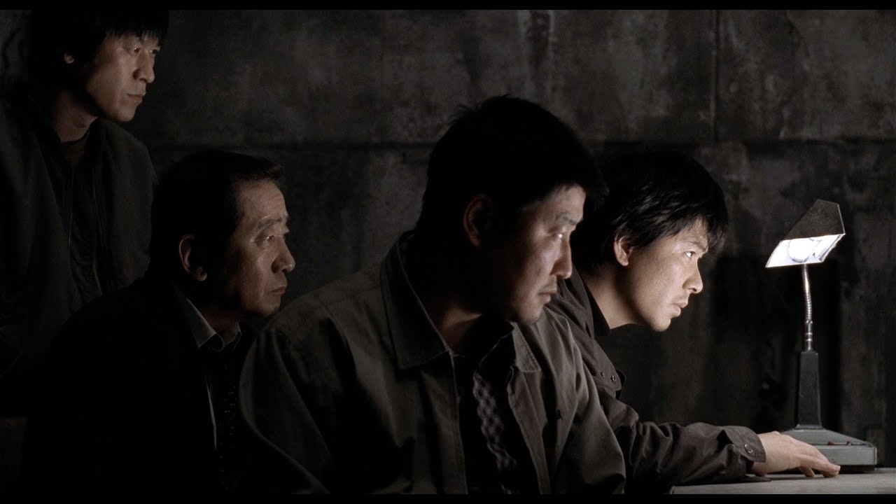 Memories of a Murder (2003)

I Saw the Devil (2010)

The Man From Nowhere (2010)
 Stoker (2013)
I think the reason I' drawn to these films in particular is most notably the genre and story that they all have. Essentially they are all variations of the crime/thriller genre with hints of other genres in there, such as mystery or drama. I also find them very raw in how they're shot. Specifically Memories of a Murder is a film that to my knowledge contains no visual effects and the portrayal of scenes and staging is simply produced through excellent cinematography and working with the actors to show relationships, whilst guiding the audience through the use of ensemble staging. Compared to films within the same genre, South Korean films have a distinct feel and look to them that is unique and different to what I'm personally used to - perhaps this is why the films I've watched from these particular directors appeal to me. They have an original and 'fresh' feel to them, in that I haven't encountered anything like it through the thriller genre in other countries cinema. Another reason foreign cinema and in this case South Korean cinema can appeal to someone from a western background such as myself is the culture difference. Throughout the many films I've watched I'm quite consistently being caught of guard by the actions of certain characters and the way the relationships work between characters. I believe this is quite possibly a feature of the culture and due to the contrast to what I'm used to it feels alien and in some cases surprising, but at the same time means for unexpected actions and dialogue from various characters within the film. This can be seen in children, parental figures, authority figures such as policemen and teachers to name a few.
There is however a mid way point between the two cultures, and that can be seen in foreign directors creating films for western audiences. Stoker is a 2013 film directed by Chan-wook Park, director of films such as Old Boy and Lady Vengeance. Stoker was Park's first English film and after seeing his other films before this, I was concerned that this would be a watered down version of his work. Although the film did feel slightly dialled down in some areas, it was just as stylish, artistic, and controversial as his previous successes - and minus the actors felt like a film from his native South Korea. It's undoubtedly different to a film such as Old Boy, containing much less violence and feels more subtle, but it works all the same and is just as symbolic and shocking in parts as his previous work. Often South Korean films can be provocative and contain things such as sexual themes or gore in large amounts if that is the basis of the story. It's hard to tell if this is a cultural thing or a restriction placed upon directors by studios and distributors but this film managed to uphold some common themes in Park's work. His 2009 film Thirst was based around vampirism and it appears, to me atleast, that it is no coincidence that this idea and the connotations continue on into his other work. 'Bram Stoker' author of the 1897 novel, Dracula felt like inspiration for the name, and he often uses the idea of vampirism to look at loss of innocence, and sexuality in the form of lust. This can be seen in both the story and the dialogue, and the film as a whole was an interesting piece of cinema showing a South Korean director's take into a story based in an American culture. I also felt the subject matter contain in the story was a perfect match for Park, who is no stranger to controversial themes. There really is some quite 'perverted' moments in the film, even if done subtly and almost entirely non-explicitly. The inclusion of this type of theme made me feel like the studio he was working with respected him as a director and that their goal wasn't to have him westernise his vision as a film maker.
Memories of a Murder (2003)
I Saw the Devil (2010)
The Man From Nowhere (2010)
Stoker (2013)
Tuesday, 10 May 2016
OUAN502 - South Korean Cinema
Something I've noticed from watching a variety of different genres of films produced in South Korea is that there doesn't seem to be any indigenous genres. Instead of this it feels like the different genres, whether it is a thriller or a story about the relationship between two people are imitations of or variations on Western and other Asian film genres. For example, Hollywood created the western genre, and Japan developed the samurai film, whereas Hong Kong invented the martial arts film. These genres are part of the culture and were developed in these regions as representations of the different histories of cultures. In contrast, it seem that South Korea doesn't have any genres of its own but took different film genres from other countries and changed them in a way which appealed to their audiences. South Korean films started by simply by taking hit films in the west and imitating them, essentially in an attempt to ensure a good return on the films that were being released. In the beginning, Korean films took the stories that already existed in other areas of the world and copied them directly. However, by means of trial and error, the film industry instead decided to adopt genres rather than imitating specific films in order to enable a steady way to catch up with Western culture when it came to cinema. This led to some unwanted consequences, and became another avenue to which western ideology and cultures were imported. Film genres as a whole developed in a strange way in Korea, and there was a struggle between people attempting to embrace the cultural aspects that came with it versus others trying to reject them.
Towards the end of the 1990s in Korea, the market share of films produced in Korea was about 25%. In 1999 the film Shiri was released, and this changed everything. Shiri was essentially the first big budget style film to be produced in the Korean film industry. It was made as a deliberate celebration of the action films that were made popular in Hollywood during the 1980s. Furthermore, it contained a story that took national Korean sentiment in order to popularise itself in the story - a winning combination with the style of Hollywood's action features. The story in Shiri essentially follows the pursuit of a North-Korean assassin by two South Korean government agents, so quite simplistic at its heart. Shiri attracted around 6.2 million viewers which broke a record previously held by (at the time the highest grossing film of all time) Titanic which had around 4.3 million viewers. Due to this combination of things and the economic boom that was happening in South Korea at the time, the market share of Korean films went up a 58 % increase from the previous year. Following this, there remained a high level of competition from foreign films in the Korean film market and film makers and studios became focused on producing the best quality films of all genres with strong characters and great stories. In to the early 2000s the film industry was ever growing and between 2001 and 2007 the ticket sales and box office revenues doubled. Shiri was extremely popular throughout the rest of Asia, and is an important film in the Korean film industry as it paved the way for some of the most iconic films not just in Korean cinema but in global cinema such as Old Boy (2003), Memories of Murder (2003), Brotherhood (2004), I Saw the Devil (2010), The Man from Nowhere (2010) and many more. Shiri was also a film that helped to catapult the career of Min-sik Choi, one of South Korea's most recognised and influential actors.

Shiri (1999)
Towards the end of the 1990s in Korea, the market share of films produced in Korea was about 25%. In 1999 the film Shiri was released, and this changed everything. Shiri was essentially the first big budget style film to be produced in the Korean film industry. It was made as a deliberate celebration of the action films that were made popular in Hollywood during the 1980s. Furthermore, it contained a story that took national Korean sentiment in order to popularise itself in the story - a winning combination with the style of Hollywood's action features. The story in Shiri essentially follows the pursuit of a North-Korean assassin by two South Korean government agents, so quite simplistic at its heart. Shiri attracted around 6.2 million viewers which broke a record previously held by (at the time the highest grossing film of all time) Titanic which had around 4.3 million viewers. Due to this combination of things and the economic boom that was happening in South Korea at the time, the market share of Korean films went up a 58 % increase from the previous year. Following this, there remained a high level of competition from foreign films in the Korean film market and film makers and studios became focused on producing the best quality films of all genres with strong characters and great stories. In to the early 2000s the film industry was ever growing and between 2001 and 2007 the ticket sales and box office revenues doubled. Shiri was extremely popular throughout the rest of Asia, and is an important film in the Korean film industry as it paved the way for some of the most iconic films not just in Korean cinema but in global cinema such as Old Boy (2003), Memories of Murder (2003), Brotherhood (2004), I Saw the Devil (2010), The Man from Nowhere (2010) and many more. Shiri was also a film that helped to catapult the career of Min-sik Choi, one of South Korea's most recognised and influential actors.
Shiri (1999)
Tuesday, 3 May 2016
OUAN502 - Pitch Perfect, Presenting Pixel Pocket
Before the presentation we agreed as a group that we would try to make the delivery of the studio concept flow much like a conversation. Going back and forth, but also make it so as individuals we take the lead on the areas of the project that we were responsible for. Presenting in such a big group made it easier as everyone brought their own views on how things have gone so far to the discussion. I was mostly responsible for talking about our finances, the website and showreel of our group. Aside from this I tried to contribute to other areas such as how we picked the studio location. This was fairly easy and was made possible by the way we have all been involved in all areas of the project throughout the duration. We chose to break down our presentation into the core areas of the business as if we were pitching to someone who knew nothing about us. We spoke about who we are, where we're based and then talked about the finances that we've worked out, social media, the promo back we provide before directing to our website and demonstrating the showreel. The logo wasn't that well recieved and could be improved but a positive about this was that it was used across all of our promotional material. However as a group we were told that our research and the thought behind the brand was quite good. Overall I think the presentation was relatively successful and the feedback we got suggested that we had thought about a good range of things in detail. Furthmore, I think throughout the project we've had a good level of communication across the board which allowed us to complete a lot of different aspects of the project such as a functioning website, showreel, and a range of branding across different platforms.
OUAN502 - Pitch Perfect, Website
The biggest job I had besides helping with the logo, the showreel and looking at finances was creating the website. Originally I had planned to create it from scratch using basic HTML but decided it would probably look better and be a lot more efficient to use a pre-existing platform. I looked at both 'Format' and 'Square Space' at platforms to host the site but eventually went with Format because it was recommended to me by a friend. The site was fairly straight forward and offered a range of options in terms of layout and different default set ups for the site itself. It was also easy to add text and images, simply by uploading them onto a selected page it meant the images would be visible. Furthermore, we had planned to have a show reel page on the site dedcated to hosting our showreel, and with the embedding options that were available through Vimeo's link to the site this was done with no problems. The issue I did have with the site during this process, is that because it was a free trial I wasn't able to edit any of the code myself and wasnt able to arrange any of the items so I was quite limited in this respect. Despite this I was still able to add the text and images I wanted to pages without too much difficulty. In terms of the sites aesthetic I wanted it to be cohesive with out branding. To do this I made it as simply as possible with only three colours; black, white and the green used in the logo. As well as this the default layout that I chose for the website was also incredibly minimalist, and I think this worked out overall. There is five pages on the site, and again, I tried to keep the number of pages to an amount that were essential. There is a home page, a page with the show reel on it, a portfolio page, and about page and a contact page. I think it's good to have everything spread out onto it's own webpage without there being too many, and it means that users of the website will be able to find anything they're look for because it has its own page. The most time consuming aspect of creating a site like this was creating assets to go on the webpages and collecting images. For example, the image on the home page was made on Photoshop by taking five seperate images of our work and cutting them together to create a visual representation of the variation in our work. I think if I was going to make a site for real it would definitely be worth paying for a subscription in order to access the services platforms like this have to offer. I would also of liked to experiment with other platforms such as 'Square Space' as I think it would be interesting to see how the different sites support the portfolio based website that is required for this type of scenario.
I'm relatively happy with the way the website turned out and in such a short amount of time. I was also happy that it was well recieved with the rest of the group and that they were content with the work I had done and the decision that I'd make with it. I think it has given me valuable experience in the options that are available and the decision that have to be made when creating a web based portfolio to host images of work and information about a brand or even an individual. Finally, I've discovered the advantages and disadvantages regarding the different levels of accessibility that platforms offer, which I believe are definitely worth paying for if you're serious about creating a website and it's an affordable price.
www.pixelpocketstudios.format.com
Subscribe to:
Comments (Atom)