Tuesday, 12 May 2015

OUAN402 - Effective Presentation Tips

We were given a presentation on how to give effective and successful presentations. I found this incredibly helpful because I knew we would be producing a lot of presentations this year on various topics and even for interim crits, so it was a very informative presentation to be given. It was quite valuable to be reminded that a presentation is essentially there to share and communicate ideas in a concise manner. In our case and many others it also allows for constructive feedback and or criticism from our peers. When giving a presentation it is important to know who you are presenting to and adjust the way you present accordingly, this includes the content, tone of voice and manner you use.

In general presentations get to me a little bit and I feel slightly anxious about presenting sometimes, more so if I don't feel especially confident with the subject matter that I'm talking about. I try my best to not let it create unnecessary stress. In order to do this I try my best to prepare as well as possible until I feel more confident with what I'm going to say and how I'm going to present to the audience. A tip that really helped me was to keep it simple, keeping it simple means that I can talk more naturally as oppose to over complicating it and making it more difficult.

We were given some presentation DOs and DONTs

You should:

  • Keep it simple
  • Be prepared
  • Know your subject
  • Use imagery to illustrate points
  • Relax
  • Be enthusiastic


You should not:

  • Use clipart
  • Use bullet points
  • Rush your words
  • Shout

OUAN402 - Copyright

The definition of copyright is that it is a legal right created by the law of a country that gives the original author of work exclusive rights to its use and distribution, usually for a limited time. The seminar we were given on copyright really cleared up any ideas or false information I had been given about the subject. One of the most interesting things I learnt about the way Copyright works in the UK is that it is automatic, and you don't actually have to do anything to protect your work except produce it essentially. Despite this, it can be hard to prove that a piece of work does actually belong to you so it is important to make sure that you do everything you can to protect it. A strange thing I learnt here is that as an artist you can mail every piece of work you do to yourself or a solicitor, the only problem with this is that it is expensive especially if the artwork itself was big. Furthermore, it would require a lot of work depending on the amount of work you produce as an artist.

When it says in the definition of copyright that it is usually for a set amount of time it means that 70 years after a piece of music for example has been released, it becomes free to own and distribute as you want as the work is no longer copyrighted. If you wanted to use a piece of copyrighted music within a piece of work for example, you would have to get permission from the organisation that distributes it and the original author of the work. To use the piece of music you would have to be given the go ahead by both parties, otherwise you would be breaching copyright. These kind of strict rules on keeping work protected is quite reassuring. I found this seminar quite informative and now feel much more confident that I understand copyright.

The Animated Self - Character

For the animation I looked a range of different character styles with various colours and influence from different artists. I wasn't sure what I wanted at first so I wanted to visually brain storm some ideas. Eventually I went with a silhouette idea to fit in with the art style that I had implemented already. I used a range of references in order to gather inspiration for the 'hunter' character in the animation and looked at things such as the deer hunter as well as the film, 'The Hunter'. I also looked at some more obscure references such as the ranger characters from the Pokemon games and military uniforms. Overall I'm quite happy with the silhouette idea as it means I can leave all of the expression down to gesture and movement as oppose to the characters expressions, and I wanted that kind of impersonal feeling to the main character as if he likes to be alone and live in the secluded area he does.

The Animated Self - Environments

Here are the main scenes from my PPP animation. They were made using mostly digital techniques and the software, Photoshop. However some of the scenes have textures in them that have been achieved using traditional techniques. I tried to use a combination of the two in order to achieve a unique feel to the art work and experiment a little with what I could pull off. I tried to carefully think of lighting, especially where there are trees in certain scenes so it appears like the light is almost piercing through the trees. Furthermore, I tried to make the general layout of the scenes consistent so I could transition fairly easily between them. Overall I am fairly happy with how they turned out, but like most things with more time I could have developed them more and improved them.

The Animated Self - Story

The purpose of my animated self animation wasn't clear to me for a while. At first I wanted to look at background or environment design because I have done a lot of that kind of work this year but after attempting a few I didn't think it would be very interesting to the audience and decided to incorporate environments into something another way. Then I considered incorporating a character into the scenes, as if they were walking through them and this would also give the audience a point of interest or something to look at whilst the environments were subtly placed in the background.

After this I decided I wanted a little bit of story or purpose to the animation or the whole thing would feel a little lacking emotionally and the audience wouldn't appreciate it very much. After taking a scene I had painted up of a cabin or a house in the woods I decided perhaps the character could be a hunter that lives in this kind of secluded environment. From here I thought up a few environments that a character of this nature would walk through such as a tundra, forests, mountains and other natural environments so it was as if he was going on a long hunting trip. This way I could also display some environments to the audience but focus could be else where. My original idea for the story was to title it 'Hunters' and have it so the hunter goes on a trip to find a deer, but before he manages to take a shot a pack of wolves come in and he calmly walks away, I thought this would provide a more interesting story due to the twist. It could also carry some form of message regarding leaving nature alone, and not intervening. However, I didn't have quite enough time before the PPP submission deadline to pull this off, but perhaps I could develop the animation further before the exhibition. The ending for now is simply a fade out when the hunters sight is set on the deer.

Research - Journey to Agartha

Journey to Agartha is one of my favourite anime films and is a visually stunning piece of animation. Directed by Makoto Shinkai, the film follows the main character, 'Asuna' who has been forced to grow up quickly following the death of her father. The opening scenes depict her coming home from school and doing house work until it's time to eat and she goes to bed. The film really takes a turn when she is attacked by a mysterious monster and saved by a boy called 'Shun'. She treats his wound, and he tells her he is from another place called 'Agartha', and that he came here to find something. From this point on the story unlike much on Shinkai's previous work becomes very fantastical, and considering he hasn't produced much work like, Ariathis before, it is a very enjoyable piece of animation. The ideas and designs for characters and environments alike are very interesting and innovative, and the art style that is very unique to him, helps him to achieve this.

One of the reasons I fell in love with the film so much as with other Shinkai films is the attention to detail in the environments and the backgrounds. Looking at the image below you can see the high level of detail and effort that has gone into producing the backgrounds and setting the scene of the film. The lighting used in the background gives it a very realistic feel. I also think that Shinkai similarly to Miyazaki is influenced heavily by nature as the setting for most of his films take in rural locations away from cities or any other form of landscape. The kind of rural farmland you expect to see in his films is shown here and remains the same throughout the film, sometimes moving onto even more uninhabited locations.


Something I've noticed about all of Makoto Shinkai's work is the use of ambient lighting throughout his films, he is a master of creating atmosphere using lighting. His films are for the most part very dark and he uses light to illuminate certain areas of his settings. Often, he uses almost a glowing effect, to give the illusion of a hazy almost sunset like lighting. Another factor about Shinkai's films that I find quite unique to him is the lack of major characters. Often, the screen time is taken up by one or two main characters and occasionally other minor characters become involves or interact with the main ones. This puts huge emphasis on their story, and is the reason we as the audience become so attached to them as the story progresses. We feel involves and care about what happens to them, and when something extreme happens whether it be a good or a bad thing, we feel that emotion reflected in ourselves because of our involvement. This, and the dramatic lighting effects using consistently throughout the animation gives off a dramatic impression, and conjurers emotion at all stages until the film is over. Personally, I find this with all of Makoto Shinkai's films, and 'Journey to Agartha' is no different, some stages are very emotionally draining. The character designs are very elegant and likable aesthetically, and we feel to them also because of that.

Like many other of his films, this films covers intense subject matters such as losing ones you hold dear and having to deal with the their loss. Makoto Shinkai is a master of inducing an emotional response from the audience. Through the combination of lighting, colour, character and story he creates relatable and moving tales involving the willingness of people to overcome problems they encounter.

Research - Sergey Kolesov

Sergey Kolesov was one of the first illustrators work I really found myself staring at being amazed at the subjects and the ideas that have appeared on the canvas. The mermaid image below is one of my favourite images by him as I really like the visceral imagery and the general brutality of the image. I don't know for sure, but it seems to me that the image could be demonstrating the idea of practices such as whale hunting because of the size of the mermaid in comparison to the boats it would be a suitable fit. Something I like about the technical side of his work is the texture and almost jagged forms he manages to portray, in the second image the astronaut has quite sharp features despite looking like an accurate representation of a human face, and I really like the way he does this. The themes in his work are often dark, or possess some form of dark humour. This is another thing I like about his work as it demonstrates the thought and intelligence behind the work itself.

Research - Miles Johnston

Miles Johnston is an artist that has really inspired me with his detailed and intricate artwork. I've seen him work in a wide variety of mediums both traditional and digital but some of my favourite work by him is his pencil drawings. They have a very textured yet structured appearance as if every line and mark is carefully constructed and adds to the overall image. At only 22 he boasts a really impressive and inspiring collection of realistic artwork after graduating from an art school based in Sweden. I am an admirer of surrealist artwork and love surrealist paintings. A lot of the work that Miles Johnston has created has been of a surrealist nature, often resembling that of dreams or strange morphing of organic materials. Furthermore, the forms he creates with people and poses that they are usually holding remind me of paintings by the pre-raphaelites and the way they portrayed figures.

He is also an incredibly diverse artist, with work in pencil, oil, charcoal, biro and digital. This kind of use of various use of different media is something I'm always trying to improve on and push myself to try. I noticed he has done a lot of life drawing work, in most cases with extended pose sometimes lasting a few hours so he can really get an idea for the shadow and form of a figure without having to produce quick sketches. His experience with drawing the human figure comes through in his work as a lot of the figures are usually shown in quite complicated shapes.

Research - Feng Zhu

Feng Zhu runs a design school in Singapore but before this was a freelance and contracted concept artist in the entertainment industry. The reason I wanted to include him as research, because ultimately he is just another concept artist, but he has put out a lot of free content online for people who want to learn how to design and I, myself have learnt a lot from him. He has worked on some quite big titles both in the film and video game industry ranging from, Gears of War to X-Men Evolution and Star Wars Episode III. He has been in the industry over 12 years and in 2009 opened his own school in Singapore to teach design to both students and professionals who want to break into the design industry. Perhaps for me, the most useful online resource he has provided me with is a series on Youtube titled, design cinema. Through this series he has talking about various aspects of the industry and often presents timelapsed videos of himself and other professionals creating work with commentary detailing what it is they are doing and more importantly, why. There is a huge amount of content available now, probably close to one hundred with an average length of around an hour or two.

Aside from this I actual really like his work, it does resemble a lot of the concept art I have seen produced by other artists but at the same time retains a unique style that is recognisable within his work. He uses a range of different techniques to produce some of the more complex or detailed designs, a busy city for example. Things such as matte painting or photo bashing techniques are often employed by him in order to add a level of realism and also to cut down the amount of time spent on designs, in a sense being more efficient. Matte painting is a phrase used to describe when pre existing images are used as a canvas to work on top of giving a sense of colour, lighting and composition before the design has begun. Photo bashing is more of a self explanatory phrase, and is a technique that involves compiling photographs to create texture and forms within a larger image.

Research - Pixar

After the recent talk by Chris Sasaki I have decided to look further into Pixar animation studios as a point of research. Pixar is an American computer animation company that was founded in 1979 under the name the 'Graphics Group'. Which was a section of the computer division of Lucas Film at the time. In 1986, Steve Jobs gave funding to the group causing it to spin out. In 2006, The Walt Disney Company bought Pixar for a value of $7.6 billion, which brings us to present day. As of December 2013, the companies feature films have grossed over $8.5 billion worldwide with the average gross per film totalling $616 million. The relationship between Pixar and Disney is an interesting one and the two companies have a lot of history together. They had disagreements over the production of Toy Story 2 which was originally intended to be a straight to video release. However, Pixar wanted it to count toward the three picture agreement but Disney refused.

Speaking about the animation team at Pixar in particular even thought there are multiple roles within the company in terms of the art department, such as character or environment designers or even storyboard artists. The animators at Pixar came from a range of different animation backgrounds.

There were disagreements between Steve Jobs and the Disney CEO at the time Michael Eisner. Jobs being on the board at the time because of his 7 percent share he had in Disney. This consequently made negotiations difficult and agreements that might have been fell through as a result. The two companies resumed efforts to come to an agreement regarding a deal in 2005 after Michael Eisner left Disney. It was around this time that Steven Jobs announced what I believe to be a bold and interesting move regarding the business side of Pixar schedule, stating Pixar films would be released in the early summer months as opposed to the November time that Disney preferred, this would mean that Pixar films would available to purchase around Christmas and the winter months.

Pixar is an incredibly creative studio that gives a lot of freedom to its employees. After watching a lot of interviews with staff members of Pixar, they all ultimately say the same thing in that they get excited by the challenges. I guess that's what PIxar looks for essentially in it's employees because it is always innovating and leading new ideas, as a forerunner for animation amongst other things.

Research - Chris Sasaki

I was unaware about Chris Sasaki until recently when we were fortunate enough to have him as a guest speaker. He spoke at length about his job at pixar and his education. I found the talk inspiring regarding the way he works, his overall process and one of the biggest things he put emphasis on was how much research he does before he goes into designing characters. This put my mind at ease because previously I thought perhaps I was doing too much research at the beginning of projects but he put my mind at ease when he said he takes a large percentage of projects just doing research alone before he starts drawing or painting for example. Another thing I took away from his talk was that he tries to use a mix of media, both traditional and digital. This again was helpful to me because I really like using traditional media and incorporating its qualities into digital production work but I had found myself doing that less and less, so in a sense it rekindled my desire to do it and experiment a little further within my work.

I really like Chris Sasaki's illustrative design style, it's incredibly unique, perhaps what makes him appropriate as a pixar character designer. It's interesting because despite the simplicity of the lines, and the overall subjects it really speaks to the viewer and relays a large amount of information just through the simple lines and tones he uses. I think especially with the first one, which is done with traditional media it's incredibly suggestive and stylised but you know immediately what it is without it being too obscure. When it comes to design like I mentioned in the post about Paranorman and the unique design style that LAIKA has, it's always fun and inspiring to see how artists and designers get the balance so right when it comes to having a unique and original style and approach but also maintaining the correct level of design and appropriateness for the audience. You can tell with the second image I have used that Chris Sasaki is a character artist purely due to the amount of character that comes through with such a simple design. The use of expression and pose here show the characteristics of the animal and despite being quite unrealistic, it is still a very relatable design. When we had the talk with Chris Sasaki, somethings that he spoke about were quite eye opening, because he said that he didn't get into the art school he wanted to and that things like that aren't necessary to break into the industry you want to build a career in, I guess ultimately it showed us that it's basically up to the individual how far they want to and can go.

Research - Eduardo Pena

Eduardo Pena is a visual development artist based in the entertainment industry. I wanted to talk about his work because it has an incredibly cinematic feel to it. As well as this, a while ago I watched a video tutorial he did on painting cinematic scenes, and from this I learnt a huge amount about camera positioning and how to make scenes feel overall more cinematic. Due to the area of his work, he has to create artwork that would be suitable for film or video games, which I feel is an entirely new design process entirely from the usual process. He also mentioned how he works, and that he tries to include as much information as possible for the production pipeline later on in the overall production. The reason I think this type of design is so hard is because you have to work as a cinematographer, a designers an artist and you have to fit all of these things into one piece.

The characteristics of his artwork is that there is a continual theme of epicness and he has a great sense of scale coming across within his images. Take the image below for example, with the sand worm type creatures. Everything about this piece is integral to creating the sense or scale and the epic feel that we get from looking at it. I noticed first the direction of the camera angle is directed upwards from a low point. This gives the creatures a greater sense of threat and dominance within the scene. I noticed the lighting he used is also incredibly cinematic in that it has that kind of piercing through the clouds look to it and creates a nice highlight off of the creature in the image. These are some of the reasons I wanted to include Eduardo Pena in my research because although there are many concept artists to look at I feel like he continually creates these very large scale vistas and as the audience we receive so much information about them because of the extreme wide shot viewpoint we are looking into the image from. I definitely feel like I should look at his work for inspiration when trying to create design work for animations because of how much he can relay through a single image.

Monday, 11 May 2015

Research - Osamu Obi

Osamu Obi is one of my favourite contemporary painters. He does a huge amount of figure and portrait work, and I don't think I have seen much if any of his work where it doesn't include a figure. From looking at his work it has become apparent that he mostly paints female figures and often has them looking away from him, out of a window for example or at something in the distance. After thinking about it, it may be an attempt to capture a certain candid elegance, instead of having the figure looking directly at him. The colours he uses a usually a little washed out yet rich and full in themselves. I have seen very few of his paintings where he uses a light source and instead opts for natural light a large amount of the time perhaps from a window or a door leading outside. This gives his paintings an almost elegant feeling to them as the light and colours are less harsh due to the light being much whiter than a yellow or orange light source. It is also notable that in his paintings he doesn't leave out environments or the setting, and makes sure to include them as a natural frame for the figure he is focusing on, these are often in the form of; walls or a sofa and other household furniture, and this theme is evident throughout a lot of his work. In terms of the expression, they always come across as very intense or somber. I personally love everything about his work, especially the use of colours which are never too bright or unrealistic but are usually quite desaturated. There is a very elegant feeling evident in his work, perhaps it's the subject matter or his approach to his work but it never fails to possess a certain finesse.

One of the things I like most about his work is his ability to capture personality and mood through the pose of the figure. A popular pose for the figures in his work is having one or both arms stretched across their chest, as if they are protecting themselves. Another popular angle for him to paint the figures is the profile view, I have noticed a literal profile is something he frequently paints from a range of distances, some close up and some further away. There are certain aspects of his work, and themes that run throughout that imply vulnerability, the pose and the inclusion of shadowy environment in combination with the nervous expression of his solitary female subjects makes me feel like he is keen to portray this in his work.


Research - Paranorman

I recently rewatched Paranorman, after deciding it would be a good film to watch based on the idea that I was going to pursue set design for one of the briefs we were given for applied animation. So I think that would be a good talking point for this blog post. But, I just want to quickly mention the art direction for the film is sublime. It has an incredibly charismatic charm to it, whether it's through the architecture, the characters or the humour that is quite well intwined with the dialogue. That is something that caught me off guard now I think about it, the humour in Paranorman is very well timed and I think it is the kind of humour that a large age range can appreciate and understand.

The first thing to note about the sets is that they are very large, when you think of miniature sets and characters LAIKA has taken it to a whole new level, in terms of detail and the overall sheer amount of work that they funnel into their films alone. It's amazing, and quite a wonder how they manage to get so much detail into their characters and environments. I think one of the reasons they go to such lengths is because of the nature of stop motion you really get to see the texture and smaller details come through because of the nature of the medium. Another advantage of stop frame is that you can create anything. Paranorman comes across very realistic in the overall tone of the film, but definitely has a unique touch, a style that comes through in every object and item they hand craft in order to keep pushing the level of detail and quality of their productions. It's hard to describe the style, apart from saying it's almost a nervous illustrator style. The lines aren't straight and sometimes this can be quite subtle unless you're looking for it, but it definitely has a unique feel that comes through in the sets. On a more technical note LAIKA has its own studios that it uses to shoot the stop frame animation. Infact, all of the production on ParaNorman took place at the LAIKA Studios located in Hillsboro, Oregon, in a 151,140 square foot building space. With a crew of over 320 designers, artists, animators and technicians. So a huge range of various disciplines are needed in order to achieve something like this. Furthmore, there were 52 separate shooting units working at almost any given time during the shoot. This just shows the amount of time and precision that has to go into the craft, and it pays off.

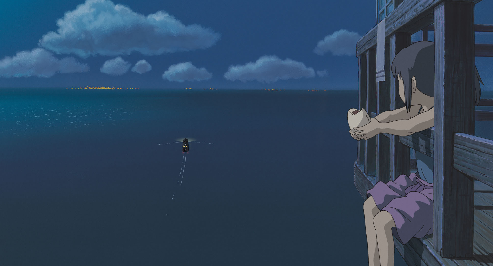
Research - Spirited Away

I wanted to talk about a second Studio Ghibli film for the research brief, and originally I was going to talk about Howl's Moving Castle but I decided against it was Spirited Away was actually the first Studio Ghibli film I ever saw and it is still one of my favourite films they have produced to date. Directed by Hayao Miyazaki and released in 2003, it is actually the highest grossing film ever released in Japan. However, I'm not at all surprised by this statistic as the combination of characters, story and Studio Ghibli charisma together make this one of the most recognised and successful films they produced.

This film really reminds me of my child hood, not just because that's when I first saw it but it's the magical and fantastical story about a young girl who accidentally enters a spirit world. Another great work by Studio Ghibli which leaves you stunned due to the incredible artwork. Some of the themes in this film are actually incredibly relatable for most people despite the fantasy element. The story starts out with a typical family; a mother, father and daughter en route to their new house. Furthermore, whatever your age from the start of the film to the end you see Chihiro who starts out as a shy, anxious character into a brave adventurer, and that is quite an inspiring tale in itself. There is so much going on within the film that it's hard to pin point specific characters or elements to talk about, the design of characters and personalities is exceptionally well done and you feel part of a small society as you watch Chihiro integrate herself. Overall, the main thing aspect to this feature that captured my enthusiasm in the first place and continues to every time I get the chance to watch it, is the design of the world that you find yourself immersed in. It's all so foreign but at the same time you completely understand it, and it's through things like this that Hayao Miyazaki's ability to design and speak to an audience through design shines.

Research - Post Production

The post production process takes place after the main production of a video, film or photography production and is essentially a term that encompasses all of the production work that takes place after the main shooting. Before the digital age analogue editing existed much more commonly where techniques such as colour grading were used. Nowadays however video editing software is used much more frequently in order to edit video, it is also a much more efficient method of working in post production.

Due to the direction I have been taking in some of the briefs we have been recently given, I have a much richer understanding about the importance good post production can do to a piece. It has also allowed me to realise the number of processes and individual aspects of something that can be edited or altered. Furthmore, because of the kind of work I was doing, I now understand the subtle changes that editing various aspects of something can have on the piece as a whole. Some of the elements I have been adjusting in my post production work has been the sound, lighting, colour correction, transitions and titles. These are just a few things that can be done during the post production process and when done right, they can work together to create a much better final outcome.

When looking at a successful post-production process in the context of a film, a film that comes to mind for me personally is Interstellar. A lot of work for the visual effects on Interstellar was the use of practical effects, so post production to adjust the footage from this would have been needed to give the film the desired final look. However, like I mentioned previously, post-production isn't just about the visuals and sound design is equally as important for the final release of a film or production. A lot of work on Interstellar in particular went into designing and mixing the sound. Something that was really emphasised in the film was the attention to small details. An example of this is replicating sounds that you wouldn’t normally notice, but are there in the background adding to the on screen experience. The director of Interstellar, Christopher Nolan made sure to make sure the sound was as accurate as possible, making sure things like the sounds of the buttons being pressed by an astronauts glove were correct. I really admire the amount of effort that goes into the design and production of films such as this and I think it's an incredibly interesting and important process for films and other video productions.

Research - Camera Angles / Shot Framing

Something that I understand quite well and take it into consideration now without fail because of what I've learnt this year is the use of shot framing. The purpose of shot framing is to direct the audiences attention to certain subjects within the area of a frame. This is ultimately achieved by moving the position of the camera as oppose to the subjects within the scene. I mentioned the brief definition of shot framing and what it entailed in a previous post, but I wanted to go into more detail about it here because I'm beginning to realise just how much of an affect it can have on the audience without it being apparent at first.

There is a few small elements that despite being quite subtle can affect the mood and way a scene comes across quite drastically. Things like depth of field, which is essentially the distance between the camera and the first objects that appear in focus. This use of depth of field, allows the artist to directly influence what the audience pays attention to by deciding what to put in focus and what to blur out. Sharpening key areas of a scene. Following on from this vignetting is also used to produce a similar effect. Objects in focus become brighter and more saturated using this technique, despite it being a naturally occuring optical phenomenon it can be produced mechanically and digitally. Finally, very simply using colour and lighting to the artists advantage it can draw the audiences attention to key subjects in a shot. Distance can also be a technique employed by an artist to allow the audience to absorb more visual information from a scene. The further away the camera is from a lone subject for example the more information the viewer can take in about the subjects surroundings area and in a sense gather bearings about the scene that they're viewing. Finally, framings main purpose as well as guiding the audiences attention is to create a visually pleasing composition and due to the nice aesthetics quality a certain framed shot might possess it will keep the audiences attention on the shot for longer.

Research - Oldboy

Oldboy is a South Korean mystery thriller directed by Park Chan-wook, who directed another one of my favourite films over the past few years; Stoker. The films is incredibly visually pleasing and I really enjoyed the style the film was made in. One of the reasons I like this film so much and why I wanted to include it as one of my research posts was because of the bizarre but intriguing story line that it has as well as the visceral and gritty violent nature of the film. The story like I mentioned before is actually quite strange, and felt to me almost like it became a tragedy in the Shakespeare style, as oppose to the mystery that it was laid out to be in the beginning. Furthermore whilst watching Oldboy I found that it ventured to emotional extremes, not not needlessly. It was quite refreshing in this sense as a lot of Western thrillers are created mostly for the shock factor or as a mechanism for building tension, this however was a carefully constructed plot. It is said that Korean cinema is one of the most creative in the world and this film really demonstrates this idea, with a complex and boarder line improbable series of events.

The ultimate themes in the film are punishment and vengeance which are heavily referenced throughout using explicit actions and dialogue to drive these ideas home to the audience. As a whole, I loved nearly every aspect of this film, I hadn't seen anything quite like it before hand and I haven't since. The dialogue from characters is quite deep and in some ways quite poetic. In a sense, the film is heavily influenced by humanity and the way that people can affect each other emotionally. Furthermore, there is a very evident psychological element to the film in regards to the audience and the way it interacts with them, it almost tests the audiences emotional limits with what they can withstand in certain scenes throughout the film. Despite the dark themes and some scenes being quite violent, the amount of violence in the film as a whole is quite low, and themes of self-indulgence and love do creep into the plot a lot more than is apparent to the audience at first. When it comes to Oldboy I can imagine a lot of people being put off by the shocking or disturbing elements it possesses, and although it is wonderfully confusing it somehow works well in drawing you into the intricate and farfetched plot line. There is a dark and gritty visual style to the film, that feels unique, it almost reminds me of a martial arts film produced in the 80's. Perhaps this almost comical style is influenced by the fact it was based off a comic book. Overall, this was one of my favourite films when I first watched it, and I could continue watching it over again.

Research - Cinematic Techniques

Over the course of the past academic year I have taken up an interest in the production of film and video, looking closely in the disseminate task at the production of the film; Interstellar and furthermore in the applied animation brief, I shot a miniature set using tracking shots and learnt a huge amount regarding how to shoot in different light levels. This also gave me the opportunity to use various different lenses such as a macro lens, which I hadn't previously used. In this post I want to talk about various cinematic techniques in an effort to learn more about the practice.

Camera Angle - The term camera angle is quite self explanatory in that it describes the angle at which the camera is aimed at a subject.

Extreme Long-shot - The term extreme long-shot refers to a panoramic shot of a location taken from a long distance away, sometimes up to a quarter of a mile. This type of shot is mostly used to establish a scene or give the audience an idea of the type of scene about to take place because of the establishing shot.

Framing - Framing, or shot framing means the way subjects of a scene or a shot are arranged in relation to the camera, and consequently what is portayed on screen. Generally, the size and volume of a scene can relay as much information to audience as dialogue or action. Examples of this are viewing characters from a low view point which in turn gives them a sense of power.

Key Light - A keylight is the main light used on a subject in a scene. The light is usually placed at 45 degrees. The type of key light can differ depending on the type of scene or the kind of lighting chosen to be used by the production team. High key lighting can light almost an entire scene, where as low key lighting provides much less lighting in a scene.

Pan - A panning shot which I used to confuse with a tracking shot, is when the camera moves round an imaginary vertical axis from left to right.

Tracking Shot - A tracking shot is the term used to describe the action of the camera moving on wheels, for example of a track, dolly, via car or even train. Tracking shots aren't limited to one direction and can move left to right or vise versa as well as backwards. Finally, the speed of the shot can again affect the connotations of the scene, slow being quite dramatic or trance like, where as an erratic fast paced pan can put forward the idea of danger or frightening connotations.

Wipe - A wipe is simply the illusion that the image is being wiped off the screen or pushed aside. In the process of being wiped it gives way to a black image. This technique is often used as a transition between scenes and was most common in the 1930s, but is much less common today.

Research - Gone Girl

I saw Gone Girl when it was first released in cinemas, and for a while after it was my favourite film because of how it was presented. It was a hugely gripping film which had me thoroughly invested from the beginning until the end. I'm a fan of the thriller genre anyway, and David Fincher is one of my favourite directors so perhaps I'm slightly bias. However, the film scene to scene was almost perfectly presented to the audience. The novel itself put forward a great story line and it seems perfect for David Fincher looking back at the film version of the novel. Something I loved about this film is how intense everything was, there was shocking scenes out of the blue, that could be something about psychological thrillers that I like so much, the unpredicatable nature of the characters for example. There's a lot of scenes in the film that when I think about the film as a whole really stand out to me because of the impression they left on me the first time I watched it. One scene in particular was when a main character is seen around half way through the film at a major turning point, almost like a plot twist but in the centre of the film. The editing and charisma that was placed into this scene through the pacing of the on screen events was great to watch and incredibly impressionable. It's also worth mentioning that the film wouldn't be what it was without the score composed by Trent Reznor and Atticus Ross. More recently in David Fincher's films, Trent Reznor and Atticus Ross have produced the score for The Social Network, The Girl with the Dragon Tattoo and more recently Gone Girl. The sounds they produce fit perfectly for the tense uncertain nature of Fincher's films and even as stand alone tracks their music is atmospheric and great to listen to.

There are aspects to the film which is very representative of Fincher's work. For example the film includes a lot of include low key lighting with different colour temperatures, often green and blue tints that give the scenes a very hazy surreal feeling. There is also a notable use of fading transitions between scenes in the films, one of the key things that I see Fincher do more than most other directors. Watching this film iin particular where the director put so much emphasis on getting the right shot, (I read somewhere that he did up to an average of fifty takes per shot) made me appreciate the amount of consideration and effort that had been placed into making sure that everything was as good as it could be. I think it was around this time too that I found myself becoming more interesting in shot framing and direction in general due to what we were looking at in class at the time.

Research - The Wind Rises

I saw The Wind Rises when it was first released in the UK. It is a film written and directed by Hayao Miyazaki and distributed by Studio Ghibli. This is also interestingly was also the last film that Miyazaki directed before his retirement in September 2013. The story used in the film, is a fictionalised interpretation of the life of Jiro Horikoshi, designer of the Mitsubishi A5M and it's successors, which was used by the Empire of Japan during World War II. The film is set in the year 1916 where we are first introduced to the character Jiro Horikoshi. Jiro dreams of becoming a pilot but his poor eyesight doesn't allow him to achieve this. During the initial period in the film, the main character, Jiro, dreams of meeting the Italian aircraft designer; Giovanni Battista Caproni. Caproni tells him that building planes is better than flying them. This opening to the film is a the typical uplifting and inspiring nature of Ghibli films, you feel the characters excitement and drive through the use of direction and animation style. The very attractive Ghibli style of animation intensifies the likability of characters and forces you as the audience to root for them as they pursue their goals and try and achieve their dreams as is the case again with this particular character. The reason I wanted to mention this film in particular over other Studio Ghibli films is that it is quite fresh in my mind and I remember being blown away by the exceptional story telling that was demonstrated in the film. It was also a great experience watching it in the cinema, and is the only Studio Ghibli film I have been fortunate enough to watch like this. The film itself feels incredibly similar to the style of the other films released by Studio Ghibli and contains the usual elements that together construct the epic tales often told in their work. The kind of notable similarities that you can see clearly in this film as the others is things like the interaction between characters and the very clean smooth animation style in combination with hard hitting plot direction. A trade mark of Studio Ghibli characters it that they are very ordinary people that end up leading quite exceptional lives, or atleast experience something rare and mesmerising during the onscreen action.

Another quality of Hayao Miyizaki's films I feel is the spontaneity and inventive direction the stories often take that keeps you so involved as a member of the audience. The animation is very subtle in places, and often there isn't a lot of on screen movement, perhaps this is one of the traits within their animating that gives it such a unique and recognisable feel. The backgrounds of scenes, however, are detailed and there will only be a few or sometimes even one moving object in the scene. You'd think this would take you out of the film but in actual fact it's the realistic backgrounds and their high level of detail that encourage the films to be so immersive. There is a huge emphasis on nature in Studio Ghibli films. Multiple scenes are filmed near or within forests. There are often streams in scenes, and act as a safe-haven for characters, giving them peace and reflection. As the audience it's the scenes where this relationship between characters and nature allows you to relate and connect with them in extreme ways. As well as this, it gives the audience to appreciate the stunning artwork included in the film, because you're not distracted by any particular action or detail. The sounds used are very real and manage to transport you into the fil itself.

Sunday, 10 May 2015

Research - Creating Worlds / Environment Design

Since wanting to pursue a career in the creative industries, environment design has always been something that has appealed to me. The idea that you can create a whole world or environment simply using ideas and influence from our already existing surroundings seems like an exciting and enriching endeavour. I think one of the most helpful tools in the process of creating environment designs of this nature, is knowledge. When we are young often we read encyclopedias and wonder at the images they contain of things we have never seen before, stars, galaxies, rain forests etc and in the process absorb all of this new imagery. These are the kind of influences that can be used as inspiration for creating imaginary worlds from scratch.

One of the most important processes or methods I have learnt whilst reading articles and watching videos on design of this nature was by Feng Zhu, a concept artist and teacher. He was talking specifically about the way when designing whether it be for a film or video game, usually the most successful route to take is to take influence from our surroundings to design. Play with the scale of real world objects and building, or even natural forms. The example below shows that small objects on the macro scale, or upsizing objects that are usually quite small can be a great way to gather ideas for various aspects of an environment. Mixing surroundings that go against what we know is also a great way to create unfamiliar yet recognisable worlds. Putting cities in swamps or desserts, historical buildings such as the pyramids in the snow or iconic architecture in perhaps what we think of as uninhabited terrain. One of the key things when creating designs from scratch is to make sure that familiar design language is used so that the audience is receptive and engaged with the ideas that fuel the design and not put off my how new and far out they are.


There are so many incredibly crafted worlds that have been created for the purpose of entertainment. An example I want to show is some of the backgrounds and environments from the 1995 film, Ghost in the Shell. I find these backgrounds not only stunning as stand alone pieces but the way the world is shown broken down through the use of detail in the buildings and the dilapidated environments is an example of a really successful portrayal of a derelict city in combination with the abandoned imagery. The process to create these hyper detailed and realistic backgrounds was quite unusual. 'The digital cel work included both original illustrations, compositions and manipulation with traditional cel animation to create a sense of depth and evoke emotion and feelings. Utilized as background, filters like a lens effect were used to create a sense of depth and motion, by distorting the front background and making the far background out of focus throughout the shot. Ghost in the Shell used a unique lighting system in which light and darkness were integrated into the cels with attention to light and shadow sources instead of using contrast to control the light. Hiromasa Ogura, the art director, described this as a very unusual lighting technique.'


Research - Traditional / Mixed Media in Animation

For this blog post I wanted to talk about the use of traditional media and its use in animation. In this era a huge amount of production work is done digitally whether it be through the use of 3D software or digital matte painting. However, having little experience with this compared to using traditional media to approach tasks I often find myself very dissatisfied when it comes to looking at the work I have produced through solely digital mediums. Of course having built up experience using traditional techniques I am going to be better at using them and it's probably fair to say that learning digital techniques is almost like starting from scratch and takes a while to build up experience and become comfortable using them. However, even in this era of animation a lot of traditional techniques can be combined with digital ones in order to produce something new and innovative in terms of its aesthetics.

A lot of the work I have produced this year where I was creating environments or characters I tried my best to combine traditional and digital media so as to retain the traditional and hand made aesthetics whilst maintaining the level of efficiency that working digitally gives the artist. An example of this would be right now I'm working on my animation for the PPP task, 'The Animated Self' and a lot of the backgrounds I have created have a mixture of scanned in textures and grains on them that have been produced by dry brush techniques or even graphite rubbings. This gives the art style a unique and very traditional feel, which I wanted to coincide with the story that I have included. Using traditional techniques in this way also means that I can more accurately translate my ideas onto paper because of my overall lack of experience with digital, I find it hard to create the types of marks or art styles that I want, but hopefully that will come with time.

Recently we had a visiting character artist from Pixar, Chris Sasaki. He spoke to us about his education and career and briefly about how he works. Someone asked him if he uses digital or traditional approaches when he is working in a studio environment and he answered stating that he tries to maintain and use traditional techniques wherever possible because of their unique look but ultimately when it comes down to studio time or being efficient with his working process, he will then transfer over to digital. Personally I find that working in a sketchbook is a great way to create loose and quick ideas through a range of different ways; pencil, pen, marker etc. Since the sketchbook briefs that were issued to us in the visual language module I have tried to remember the importance of sketchbooks and use it whenever I can both for personal work and for the initial period when starting a new project because of the level of accessibility it has in contrast to digital work where you have to be at a computer in order to work.